For new projects & collaboration opportunities:
Say Hello
For insights & ideas:
Sign up for our newsletter
For good vibes:


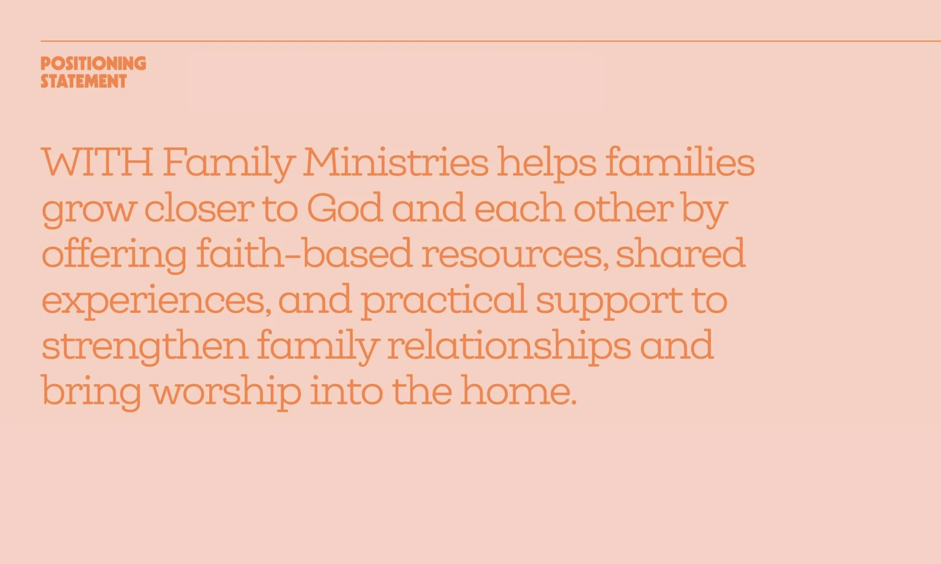
How do you market to parents? You recognize that they don’t have the time or patience for marketing. Our approach to the WITH Families brand was rooted in understanding that the attention economy only makes room for people who have time to spare. Many parents have already figured out their priorities, but they’re looking for ways to make them sustainable. They know they want to teach their children about Jesus, but they need resources to make it more manageable.
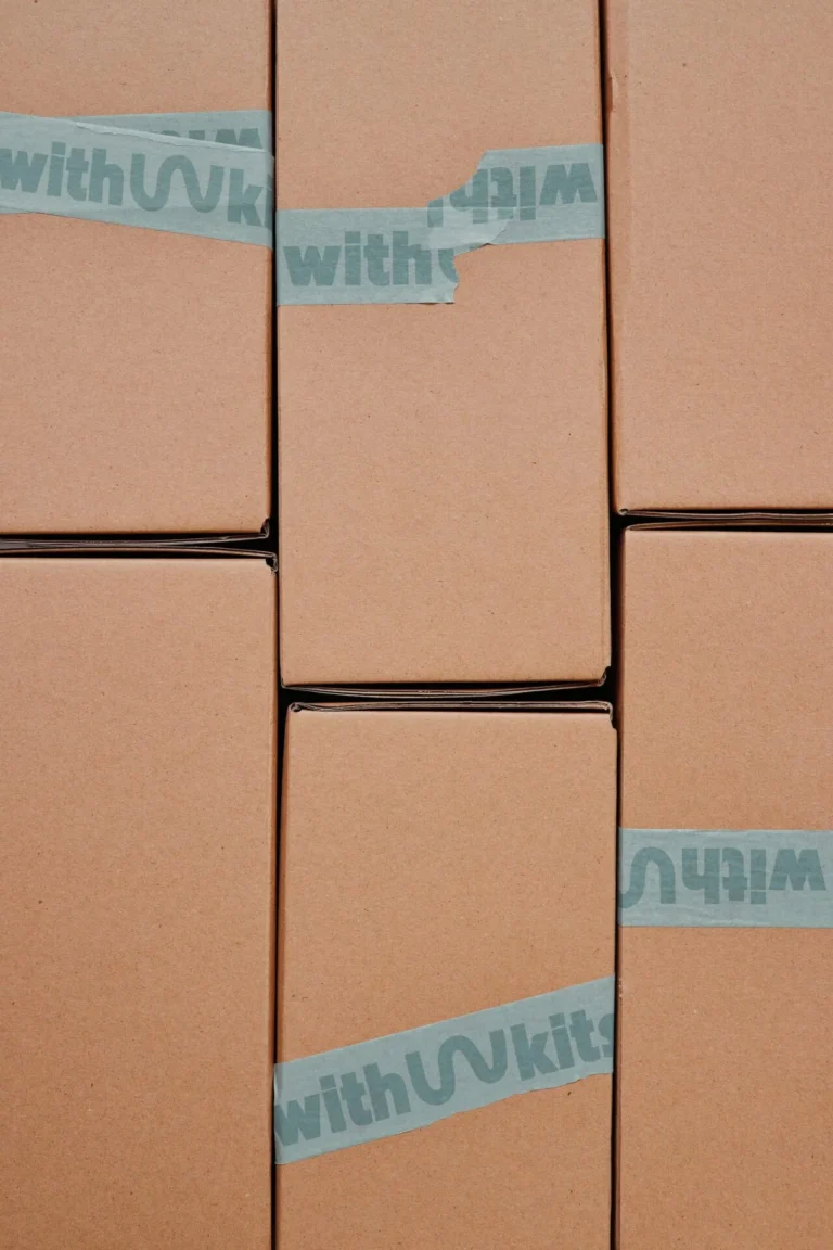
That is the heart behind the WITH Kit: a monthly box of Bible lessons and activities meant to be explored as a family. It became the guiding premise for the brand we designed. More specifically, we were drawn to how the Harveys thought about worship. WITH Kits aren’t designed to merely emulate Sunday School or extend a church service throughout the week. They offer a bigger picture of what worship can be: a lens for the world and a practice as natural as eating breakfast.
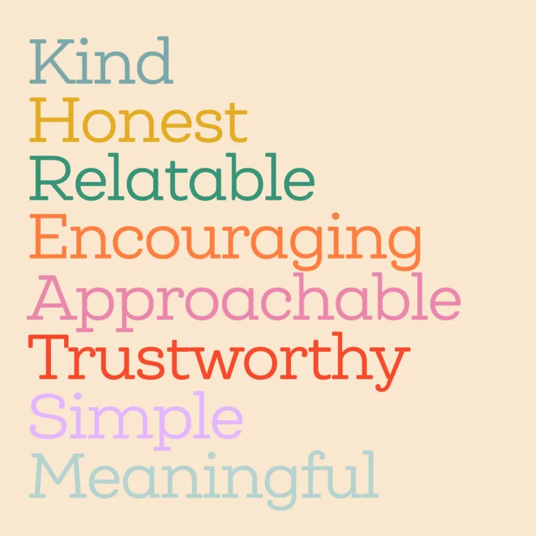
While the boxes were in the works before we signed on, a huge part of our role was definitional— helping the Harveys find the right way to frame such a unique venture. Through our conversations with Dallas and Martha, we identified five core values:
When we thought about how these values intersected, we came up with a simple tagline: Everyday faith for every family.

While we focused on how to market to parents, we also recognized that parents aren’t the only important audience. We also wanted kids to feel valued for being kids. We chose a bright color palette, one that evokes the vibrancy of a sunny playroom or a Sunday School classroom, reminding kids that following Jesus is dynamic, not dogmatic. If a parent hands a child a WITH Kit, it should be something they want to open.
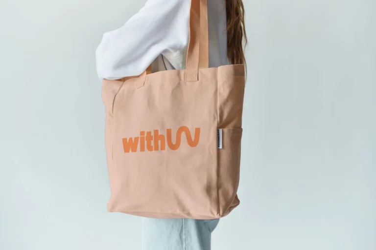
For something so hands-on, the brand itself needed to be tactile and organic, starting with the logo.
We developed a few possible directions before opting for what you see below. The W immediately sets the tone for WITH’s work by suggesting that learning about God can be fun and unpredictable. The icon showcases the letter expanding beyond its constraints, reflecting the expansive nature of faith. Furthermore, by distributing its weight asymmetrically, the icon evokes both a flowing river and peaks and valleys. For a ministry designed to encourage spiritual growth, it felt appropriate to reflect the way that growth in faith is rarely a linear arc.

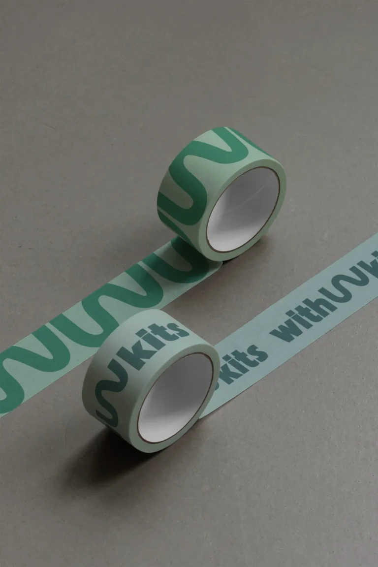
Finally, we complemented the design with a visual language comprised of shapes. These could be used for a wide array of purposes, but the big one is simply a way to differentiate each box in the WITH Kit line. That way, the Harveys can make the WITH Families brand feel constantly fresh while staying recognizable.
Ultimately, this WITH Families branding project was more than an exercise in how to market to parents because worship is about more than that. Our task was simply to help a ministry showcase what makes it so special, and it’s a privilege to know so many lives will be blessed through WITH Kits.