Color is one of the most powerful tools in branding, but what happens when you don’t have enough of it?
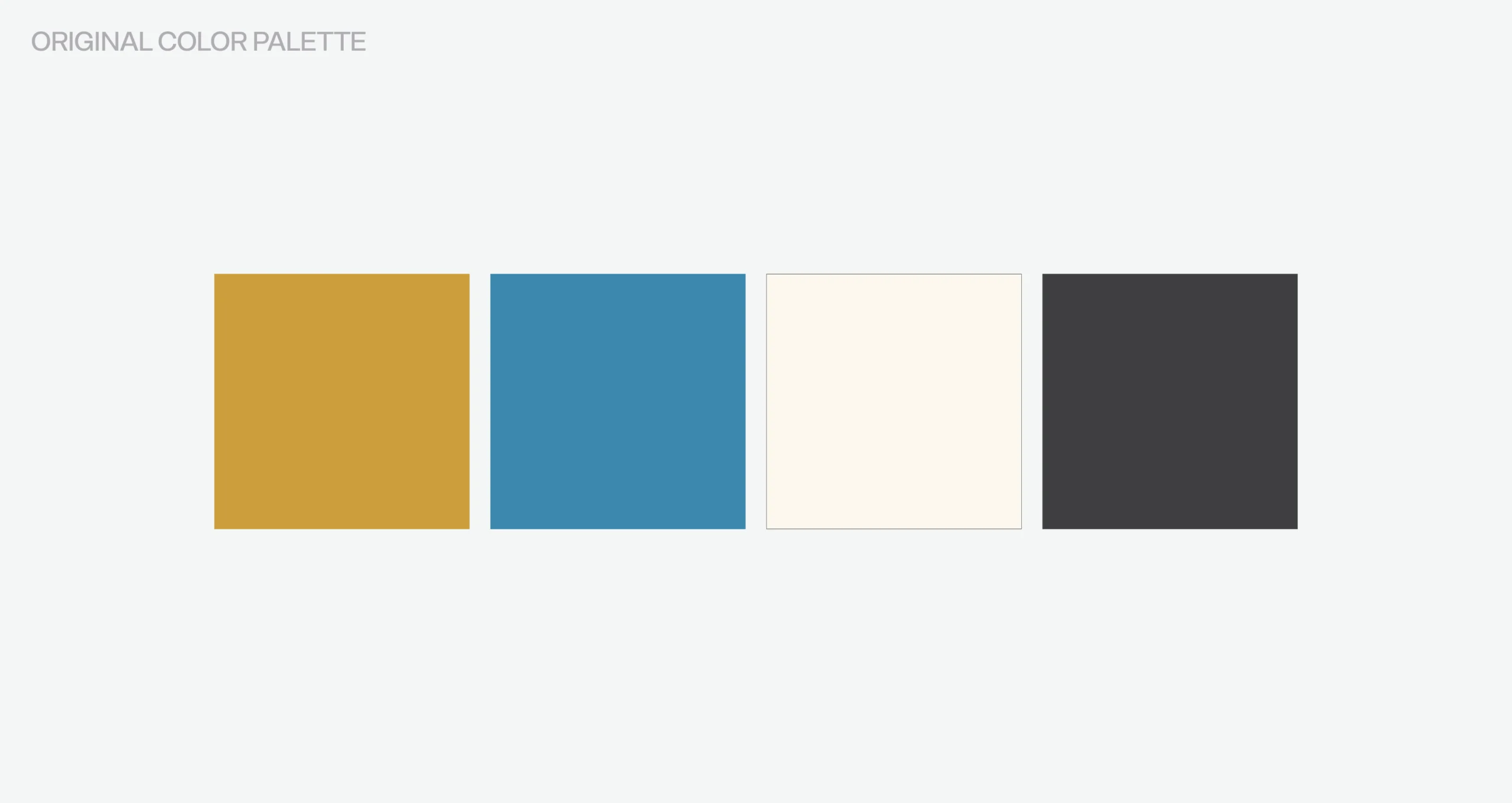
When Harvest Church in Carmel, Indiana came to us, they already had a brand that they liked that featured a color palette of blue and gold. However, in view of the church’s diverse programs and ministries, they found it challenging to fully express their identity with only two colors. Recognizing the need for a broader spectrum, Harvest Church turned to our team at Amenable to integrate expanded church branding ideas that could enrich their visual identity and offer much-needed flexibility for future projects.
Concept Development & Church Branding Ideas
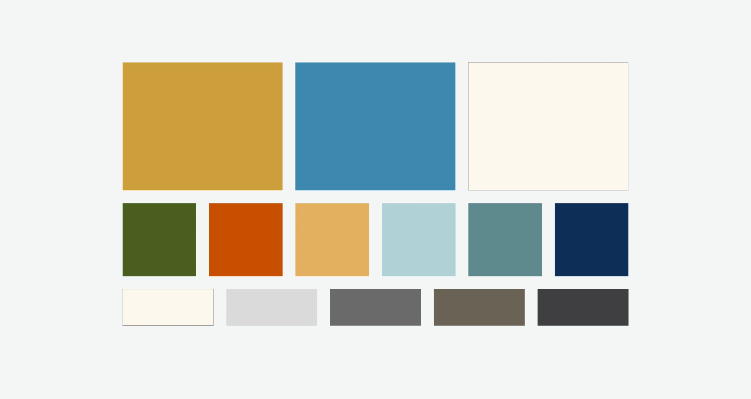
We kicked off the project with a brainstorming session designed to capture the spirit and values of Harvest Church while exploring fresh church branding ideas. In response to that conversation, our design team developed two options for expanded color palettes to complement the primary brand colors of blue and gold. Both options included secondary variations of seven colors and a defined neutral palette to ensure consistency and versatility across all applications. Our design team presented Harvest Church with two proposals to choose from:
1. Earth tones palette: Featuring natural, grounded hues that evoke a sense of stability, warmth, and approachability. Earth tones are often associated with growth, reliability, and authenticity—qualities that resonate deeply with community-focused organizations.
2. Jewel tones palette: Featuring rich, vibrant colors inspired by precious gems. This palette delivers an upscale, energetic, and modern feel, perfect for a diverse audience while still conveying a sense of tradition and reverence.
After careful review, Harvest Church chose the earth tones palette, feeling that the earthy hues aligned perfectly with their mission of creating a welcoming and nurturing environment for their congregation and community.
Updating the Brand Guide
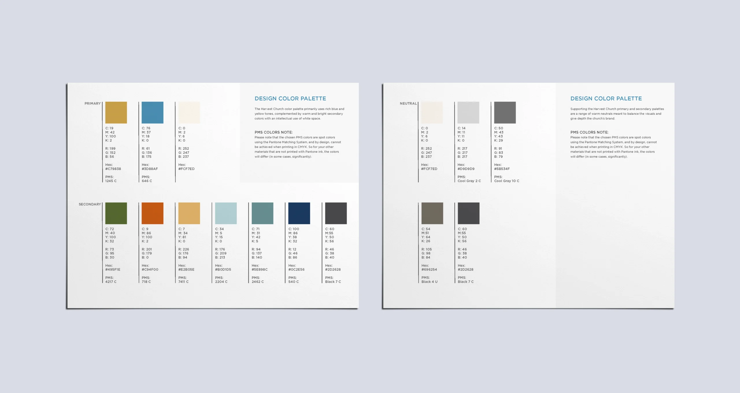
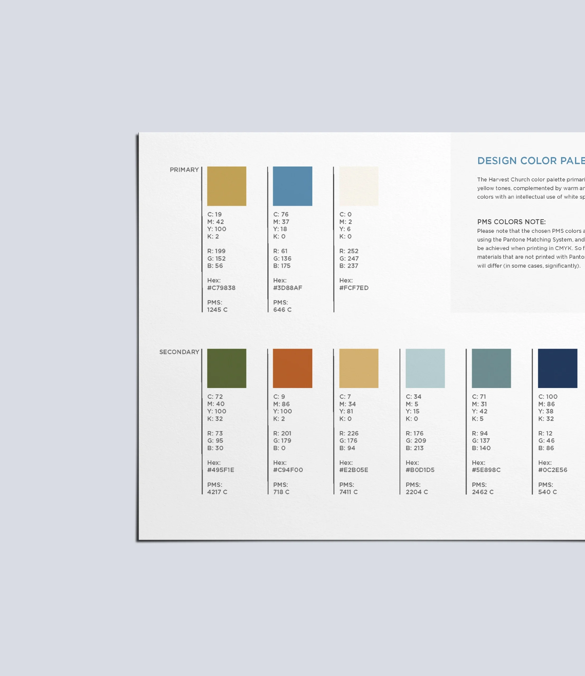
Once the earth tones palette was chosen, our next steps were to update Harvest Church’s brand guide to reflect the expanded palette. Our designers added two new pages to their existing brand guide, taking care to blend the pages seamlessly with their current formatting. These pages detailed the color codes for the seven new secondary colors, listing hex, CMYK, RGB, and Pantone references. If that sounds complicated, it’s essentially a way to ensure that it’s easy for a designer to use the same colors each time they design something. This step was crucial in providing the Harvest Church staff with clear, precise instructions for future applications, ensuring consistency and accuracy across all media.
Adding these pages is a prime example of how simple yet thoughtful church branding ideas can make a substantial difference. By equipping the church’s staff members with a robust, well-documented color palette, we ensured that every future project—whether it be digital, print, or environmental design—would faithfully reflect Harvest Church’s refreshed visual identity.
The Power of a Well-Defined Color Palette
A robust color palette isn’t just about aesthetics—it’s a powerful communication tool. For churches, conveying a sense of community, trust, and inspiration is essential, and a carefully curated visual brand serves as a witness to those values. Here’s why:
Enhanced visual communication: A varied color palette allows for more nuanced messaging. Different colors evoke different emotions and mental associations, which helps tailor communications for specific audiences. Harvest Church can now differentiate between its various ministries while maintaining a cohesive overall look. This strategy ensures that each program feels unique yet part of the larger community.
Flexibility across media: Whether it’s digital content, printed materials, or event signage, a well-defined color palette ensures consistency across all platforms. This uniformity reinforces the integrity of the church’s brand and makes every piece of communication immediately recognizable.
Empowerment of church staff: Providing clear guidelines and precise color codes empowers the church staff to confidently and creatively produce new materials. Precise documentation reduces the risk of brand dilution and ensures that the church’s identity remains strong and consistent over time.

Why Professional Design Matters
In today’s fast-paced world, where first impressions are often formed in seconds, professional design is not a luxury—it’s a necessity. Hiring experienced designers to refine and expand a color palette can lead to transformative results:
Expertise & creativity: Our designers bring a wealth of knowledge and creative insight that can elevate a brand beyond its existing boundaries. Their ability to conceptualize and implement innovative church branding ideas is crucial in today’s competitive digital landscape.
Attention to detail: When working with colors, precision is key. Our designers ensured that every shade was carefully chosen and thoroughly documented, providing Harvest Church with a comprehensive guide that could be reliably used for years to come.
Strategic alignment: With a robust and flexible color palette in place, Harvest Church is well-equipped to evolve alongside their community without fear of outgrowing their brand. This adaptability is a cornerstone of successful long-term branding, ensuring that the church’s brand remains relevant and attractive regardless of future shifts in design trends.
Church Branding Ideas That Make a Lasting Impact
Our collaboration with Harvest Church is a clear example of how creative church branding ideas can breathe new life into an established identity. By expanding their color palette and refining their brand guide, we helped the church develop a more dynamic and versatile visual language that will serve them well in the years to come.
This project’s success highlights the importance of a well-crafted brand identity in conveying a church’s values and engaging diverse audiences. It also underscores the value of professional design, which brings clarity, creativity, and strategic insight to every endeavor. As Harvest Church continues to grow and connect with their community, we look forward to seeing the ways they use their enhanced visual identity to communicate their message powerfully and effectively.