Tim Doyle was a Christian who knew what it meant to hope despite suffering. After being diagnosed with a degenerative disease at the age of 16, Tim’s life was marked by chronic pain. Yet, even in the midst of his own difficulties, Tim cared deeply about helping others experience the goodness of God. Starting in the late 90’s, Tim founded a website as a platform to share resources, reflections, and personal stories of hope and encouragement, particularly for those enduring hardship. Over time, his site grew into a large collection of writings and resources, but it remained a largely text-heavy and outdated web presence.
After Tim’s passing in January 2024, his wife, Becky, asked Amenable to help redesign his website. She wanted to ensure that Tim’s voice would continue to reach people, but the website’s format was limiting its potential. Becky envisioned the site as more than a simple archive of Tim’s work—she wanted it to serve as a living memorial, a place where his legacy could continue to inspire and comfort others, and a platform where she could contribute her own voice and perspective.
After Tim’s passing in January 2024, his wife, Becky, asked Amenable to help redesign his website. She wanted to ensure that Tim’s voice would continue to reach people, but the website’s format was limiting its potential. Becky envisioned the site as more than a simple archive of Tim’s work—she wanted it to serve as a living memorial, a place where his legacy could continue to inspire and comfort others, and a platform where she could contribute her own voice and perspective.
Why Redesign a Website?
The question "why redesign a website?" quickly became central to this project. From the start, it was clear that this project would involve more consideration than a simple update. Redesigning Tim’s website was about more than just revamping the site’s appearance—it was about celebrating Tim’s legacy while inviting new visitors into a shared experience of hope, reflection, and healing. We wanted to build a space where Tim’s work could speak for itself while offering an easier, more intuitive user experience.
Our team kept several priorities in mind as we began this project:
Our team kept several priorities in mind as we began this project:
We wanted to preserve Tim’s voice.
One of our top priorities in the redesign was to preserve the integrity of Tim’s voice. His website reflected his deep convictions, his enthusiasm for helping others, and his personal experiences with suffering. Every word he wrote was filled with meaning, and we recognized the importance of maintaining his voice through the redesign. Instead of heavily editing his writing, we opted to let it stand as it was—honest, heartfelt, and human.
While modernizing a website can improve its visual appeal and functionality, changing Tim’s voice would have compromised the very essence of what the site was meant to be. By preserving his unique mannerisms, language choices, and sometimes imperfect phrasing, we ensured that Tim’s message remained authentic to how he expressed himself. It was an intentional choice that respected Tim’s legacy and allowed his words to continue reaching people in a genuine way.
While modernizing a website can improve its visual appeal and functionality, changing Tim’s voice would have compromised the very essence of what the site was meant to be. By preserving his unique mannerisms, language choices, and sometimes imperfect phrasing, we ensured that Tim’s message remained authentic to how he expressed himself. It was an intentional choice that respected Tim’s legacy and allowed his words to continue reaching people in a genuine way.
We wanted to make Tim’s content easier to navigate.
Another key aspect of the redesign was making Tim’s content easier to access and navigate. His original website was filled with valuable resources, but the sheer volume of text was overwhelming, making it difficult for visitors to find specific information or connect with the most meaningful content.
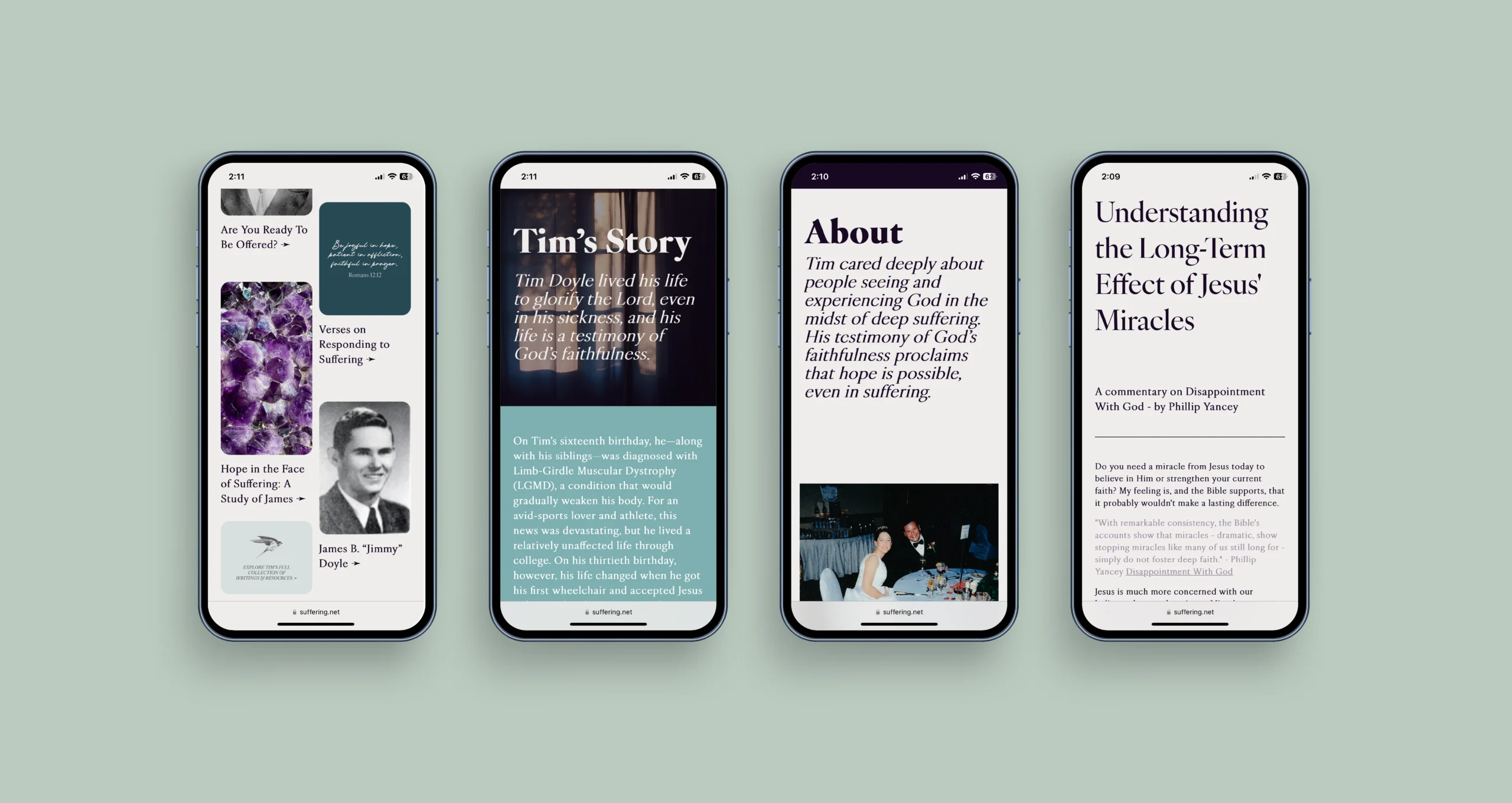
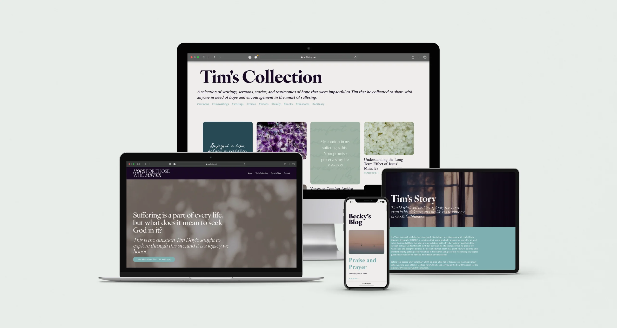
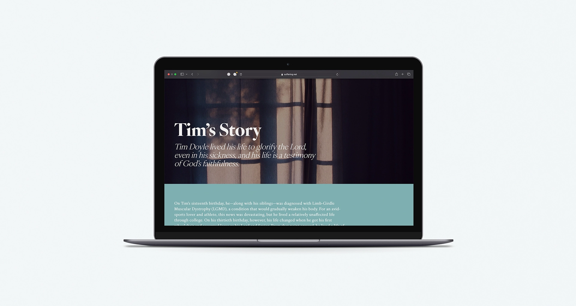
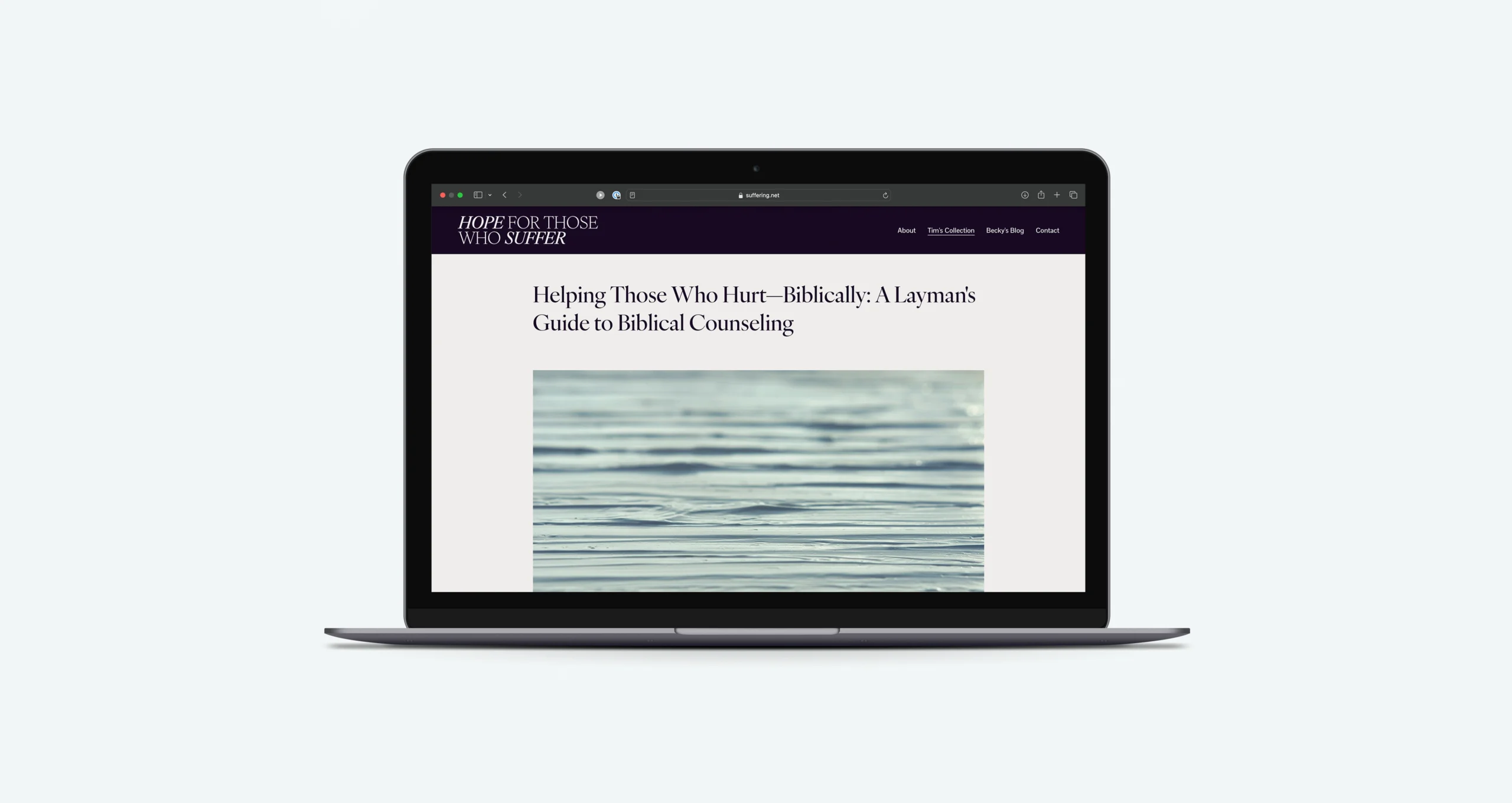
To address this, we reimagined the website with a more visuals-forward approach. We honed in on the concept of highlighting Tim as the “curator” or “tour guide” of his own archive. The redesigned site is now reminiscent of a museum or gallery, where visitors can browse through quotes, images, or excerpts from Tim’s writing. These dynamic elements invite users to click on items that resonate with them, much like they would in an art gallery where each piece tells a deeper story.
By blending visuals with text, we made it easier for people to engage with Tim’s message in a way that feels natural, accessible, and compelling. This transformation of the website—from a static collection of writings to a visually appealing experience—demonstrates why redesigning a website can drastically improve both the user experience and the impact of its content.
We wanted to continue Tim’s mission.
While the redesign focused heavily on Tim’s work, it also created space for Becky to continue her own writing and further the testimony of Tim’s life. This was an important element of the project. Becky’s favorite colors became a key part of the design palette, softening the overall look while respecting the reflective nature of the content.
The final product became a blend of multiple purposes: an archive of Tim’s writings, a memorial to his perspective, a platform for Becky to share her own journey, and a space dedicated to dialogue with people who are suffering. This expanded purpose aligned with Tim’s original mission of helping others feel seen, loved, and understood. By incorporating Becky’s voice, the site continues to evolve and serve as a beacon of hope for visitors. It’s no longer just a static repository of past content, but a living, breathing space for ongoing conversations and reflections on suffering, faith, and healing.
The final product became a blend of multiple purposes: an archive of Tim’s writings, a memorial to his perspective, a platform for Becky to share her own journey, and a space dedicated to dialogue with people who are suffering. This expanded purpose aligned with Tim’s original mission of helping others feel seen, loved, and understood. By incorporating Becky’s voice, the site continues to evolve and serve as a beacon of hope for visitors. It’s no longer just a static repository of past content, but a living, breathing space for ongoing conversations and reflections on suffering, faith, and healing.
Why a Website Redesign Matters
Visitors can now easily navigate Tim’s work, feeling connected to both Tim’s legacy and Becky’s ongoing contributions. This experience is why redesigning a website can be transformative—it allows for a deeper emotional connection between the content and the user. It’s not just about functionality or aesthetics. It’s about transforming a digital space into a more meaningful and accessible experience for users. We needed to make the site easier to navigate while preserving the integrity of Tim’s message and the authenticity of his voice. This careful balance drove all our design and content decisions.
The redesign of Tim Doyle’s website was much more than a technical update—it was a thoughtful process of curating a space that honors Tim’s legacy while inviting others into his story. By creating a visually engaging, easy-to-navigate site that preserves Tim’s voice, we’ve ensured that Tim’s message of hope and faith continues to reach others, while also giving Becky a platform to carry that mission forward.
The redesign of Tim Doyle’s website was much more than a technical update—it was a thoughtful process of curating a space that honors Tim’s legacy while inviting others into his story. By creating a visually engaging, easy-to-navigate site that preserves Tim’s voice, we’ve ensured that Tim’s message of hope and faith continues to reach others, while also giving Becky a platform to carry that mission forward.

