When we started our work with Love Chapel, an organization that offers food and housing to those who need it in Bartholomew County, we quickly realized that the previous website did not encapsulate the breadth and depth of the impact that Love Chapel has in their community. At Amenable, we understand how your organization may be so focused on the day-to-day tasks that you may not be in a position to communicate the incredible impact that your organization has, and that was the position Love Chapel was in. Closing the gap between who you are and how you show it is an exciting part of nonprofit web design, and it was the momentum behind this project.
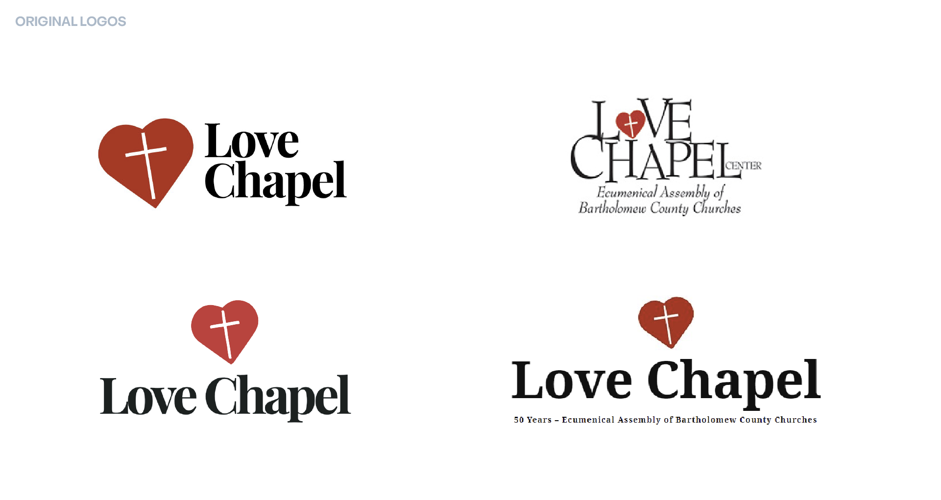
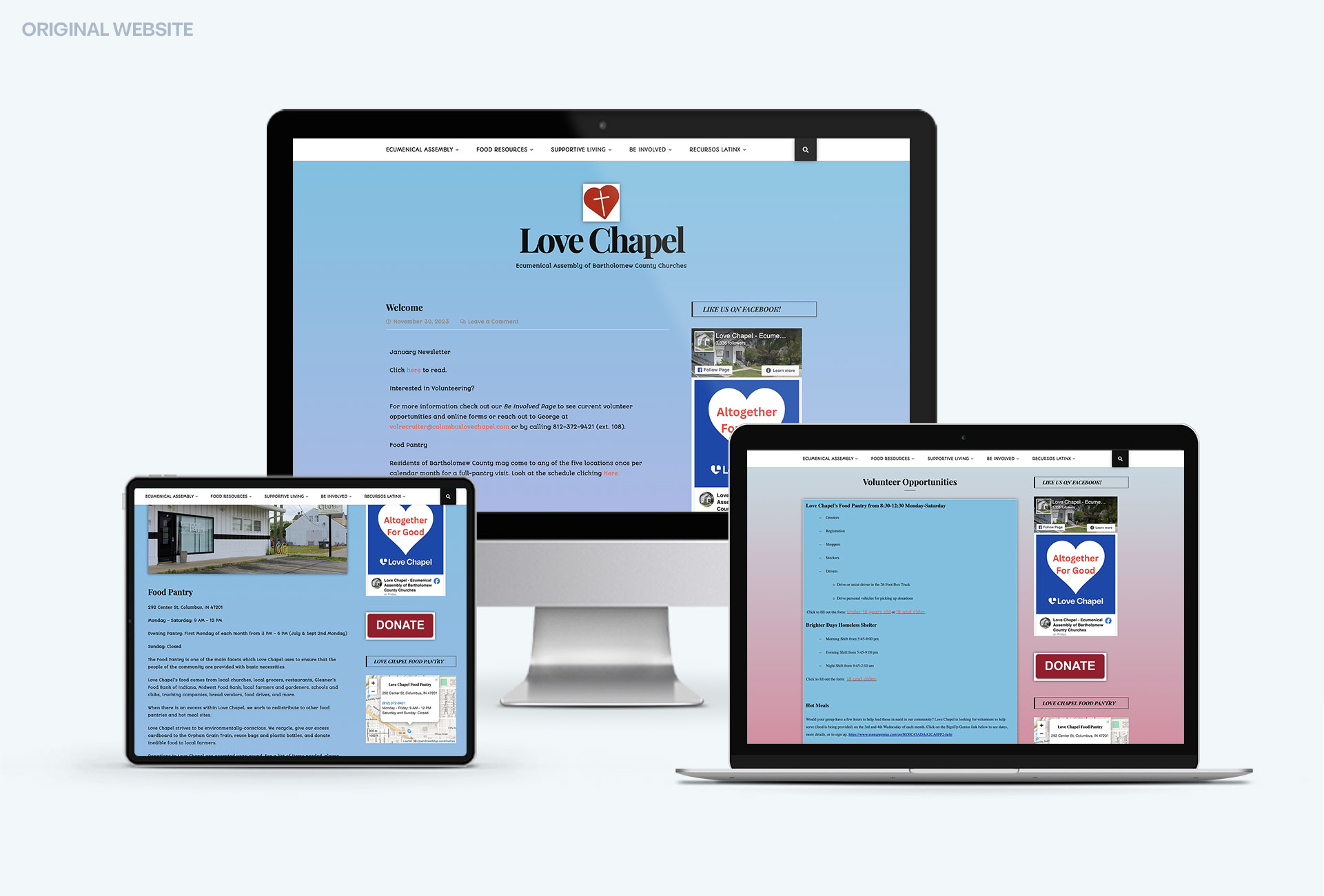
Love Chapel is known throughout its region by their deep commitment to their work, and that enthusiasm has attracted volunteers and donors for decades. If someone needs a hot meal or a place to stay in Bartholomew County, Love Chapel is the first place they’ll go. In other words, the organization had a lot of name recognition before we met them, but they also had a problem: their website was hard to navigate and not straightforward, which meant that most initial connections had to be through word-of-mouth. Furthermore, their brand was relatively informal, which undersold how robust and healthy their organization is. It was a strong example of why nonprofit web design matters so much—it’s a way for an organization to clearly communicate who they are. With that in mind, updating the website and brand became our two main goals.
Website
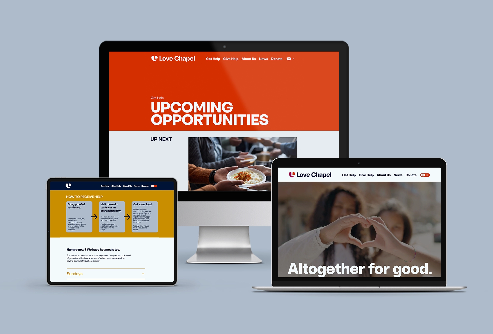
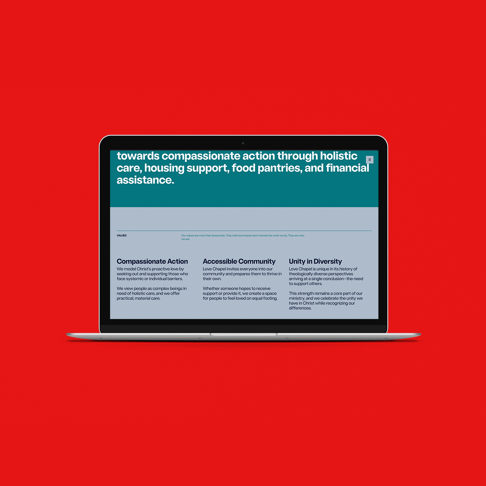
From the old website, we noticed the challenge in identifying the different opportunities that Love Chapel offers, both to those who are seeking help and those who want to help. While it offers great programs and opportunities like Brighter Days housing, the Food Pantry, and financial assistance, there were so many hurdles to get through to find basic information on each of those opportunities. Our first decision was to create two main “pathways” on the site—one for people seeking help, and one for those offering help. This became a simple visual cue to emphasize that Love Chapel is built for people who want support, and there’s nothing shameful about seeking support. For people seeking help, we also knew that they would probably visit the site feeling overwhelmed, so our goal was to simplify everything as much as possible, including clear eligibility requirements, FAQs, and enrollment processes, which we showcased with bright and simple graphics. If someone has questions, they can find answers in seconds.
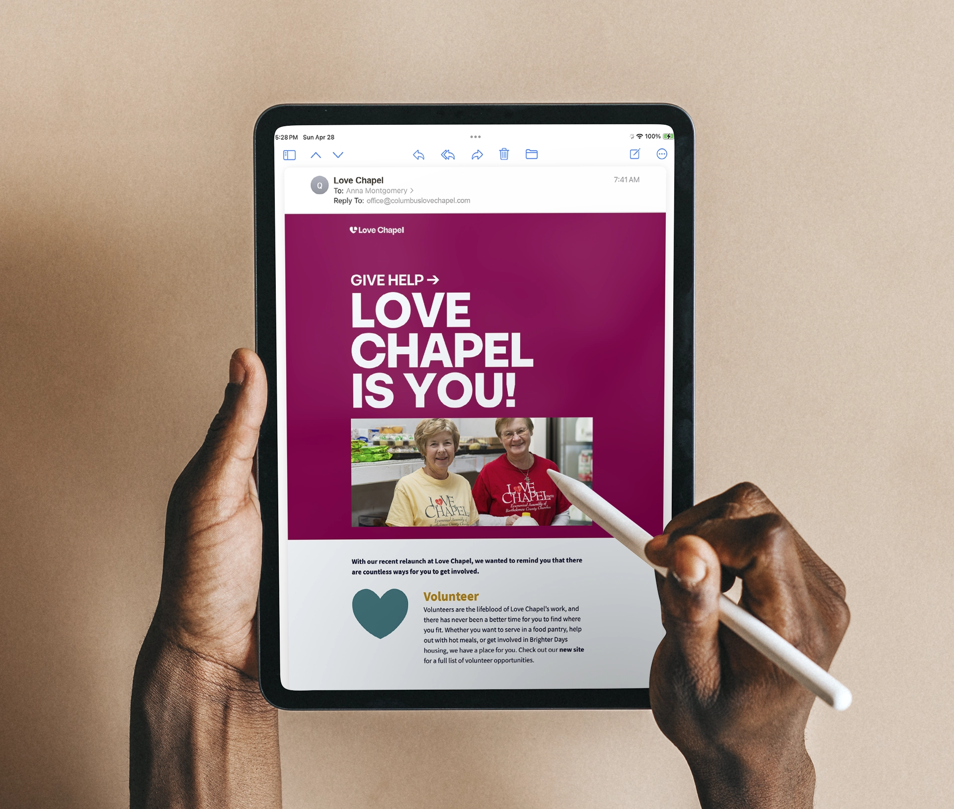
For those interested in giving help, we wanted to emphasize how eager Love Chapel is to invite people into their volunteer community and the numerous opportunities that are available, so we built separate pages for each branch of their work. We also collected content from Love Chapel staff to build out robust FAQs, making it incredibly easy to find answers to even the most niche of questions. Speaking of collecting content, nonprofit web design can often be challenging if clients don’t dive in. While we wrote the whole site in a new, personable voice, it wouldn’t have been possible without the Love Chapel staff going above and beyond in providing us with information. They generously collected pages upon pages of detailed explanations of how Love Chapel works, which made the writing process a breeze.
For those interested in giving help, we wanted to emphasize how eager Love Chapel is to invite people into their volunteer community and the numerous opportunities that are available, so we built separate pages for each branch of their work. We also collected content from Love Chapel staff to build out robust FAQs, making it incredibly easy to find answers to even the most niche of questions. Speaking of collecting content, nonprofit web design can often be challenging if clients don’t dive in. While we wrote the whole site in a new, personable voice, it wouldn’t have been possible without the Love Chapel staff going above and beyond in providing us with information. They generously collected pages upon pages of detailed explanations of how Love Chapel works, which made the writing process a breeze.
Brand & Tagline
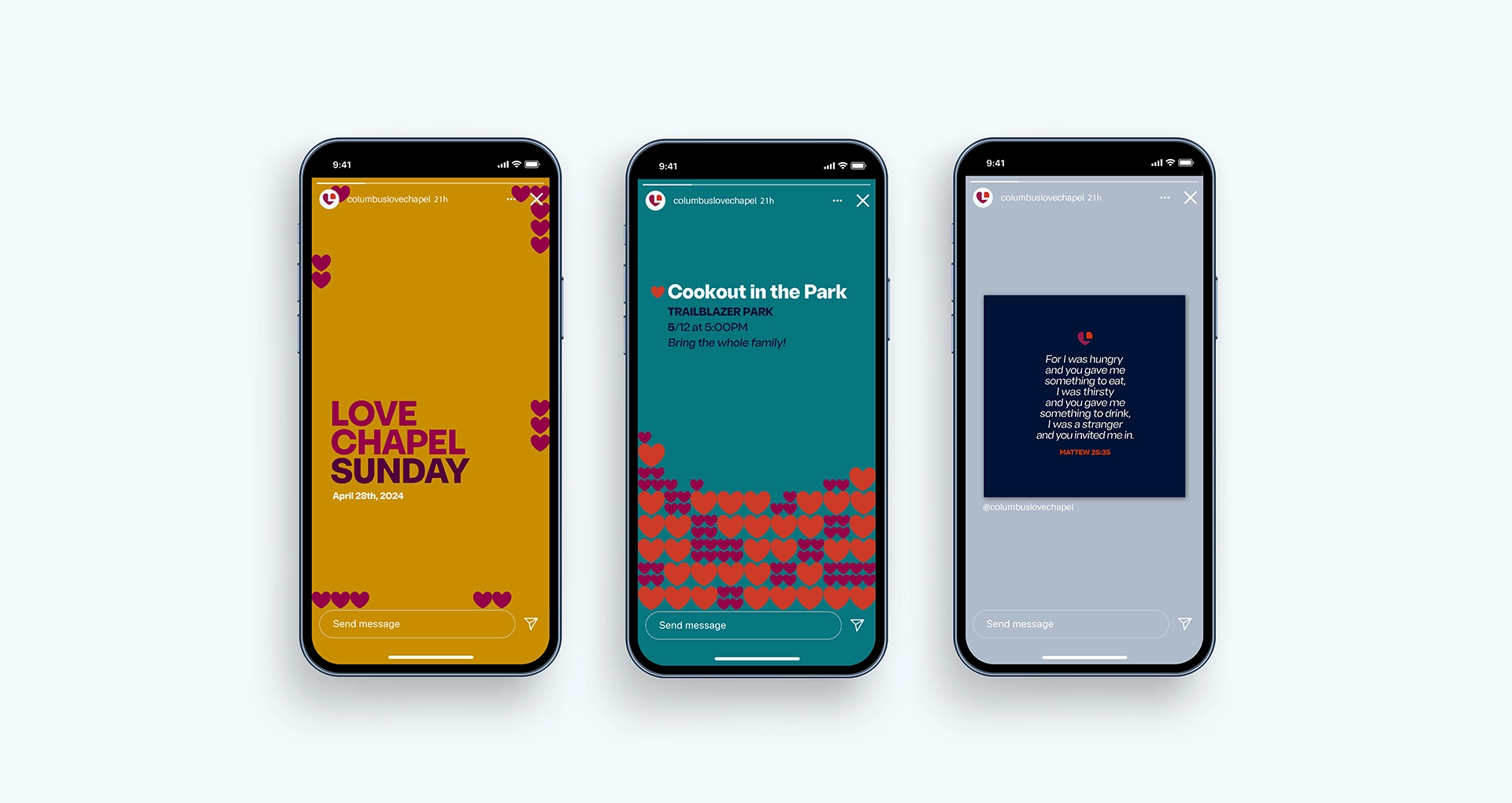
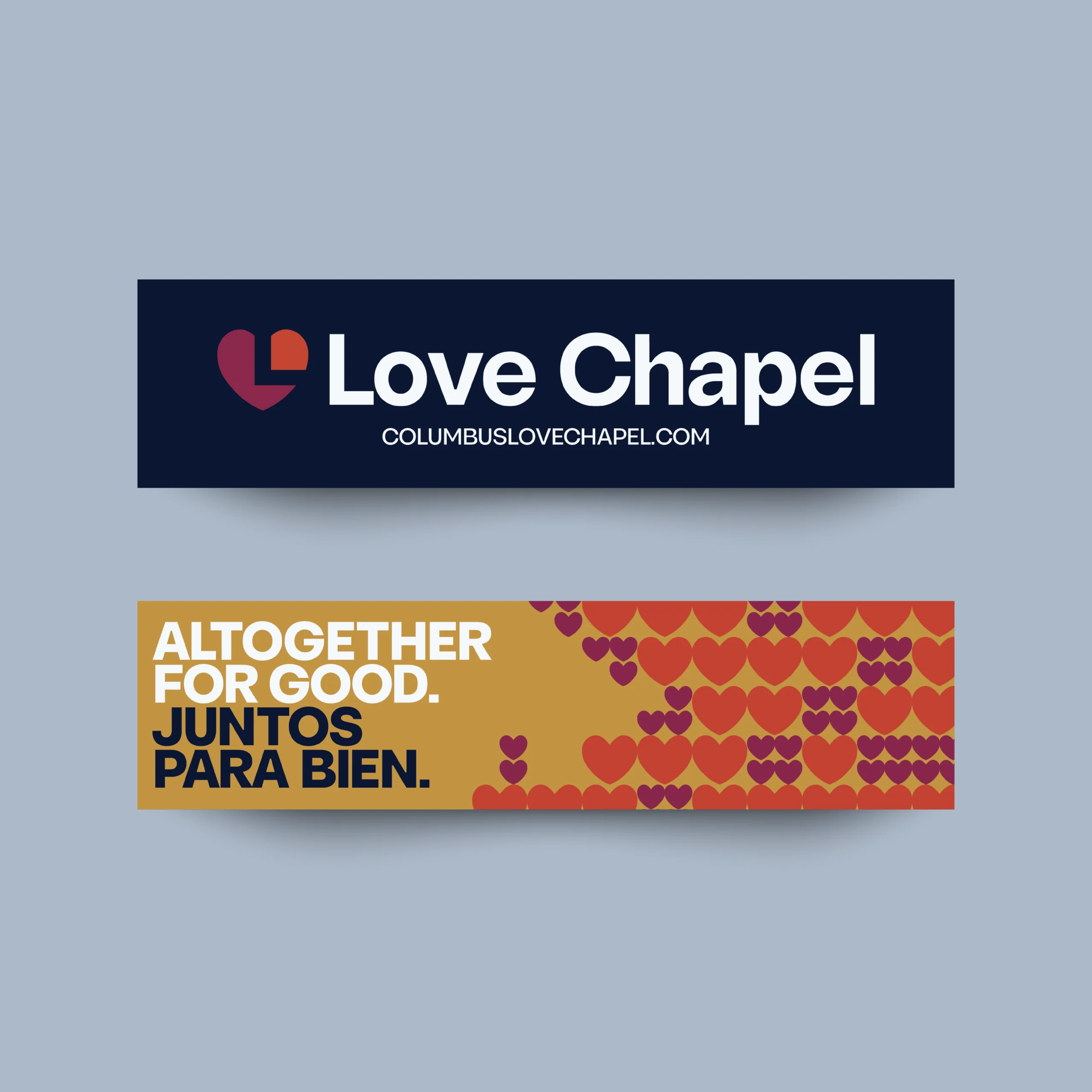
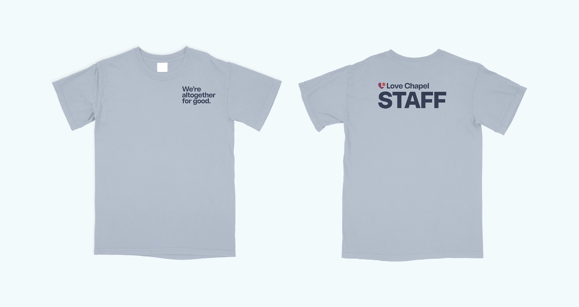
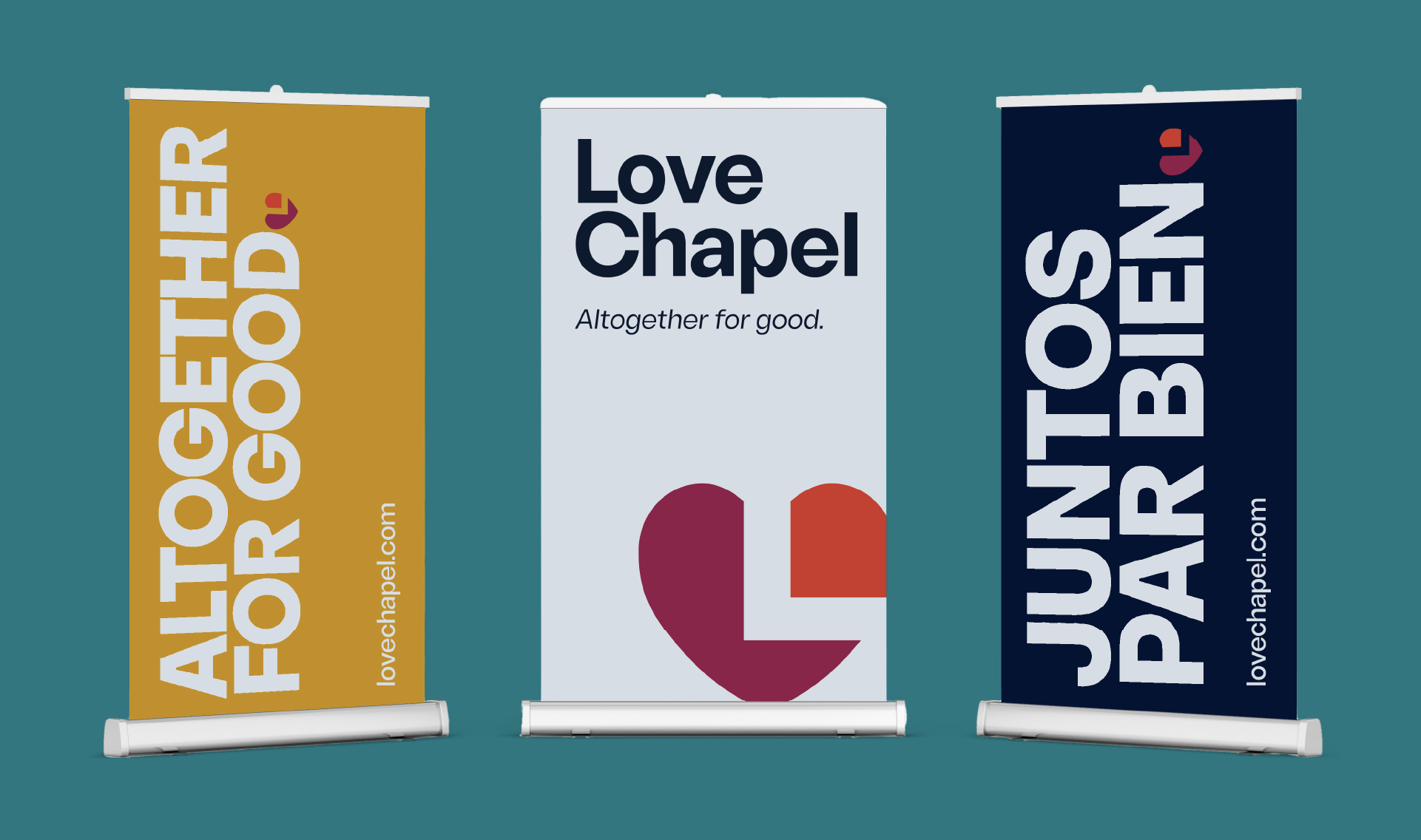
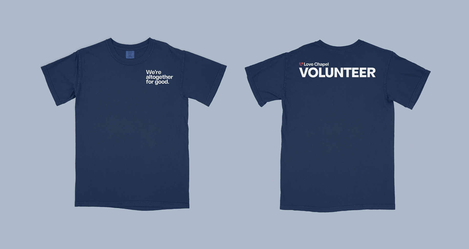
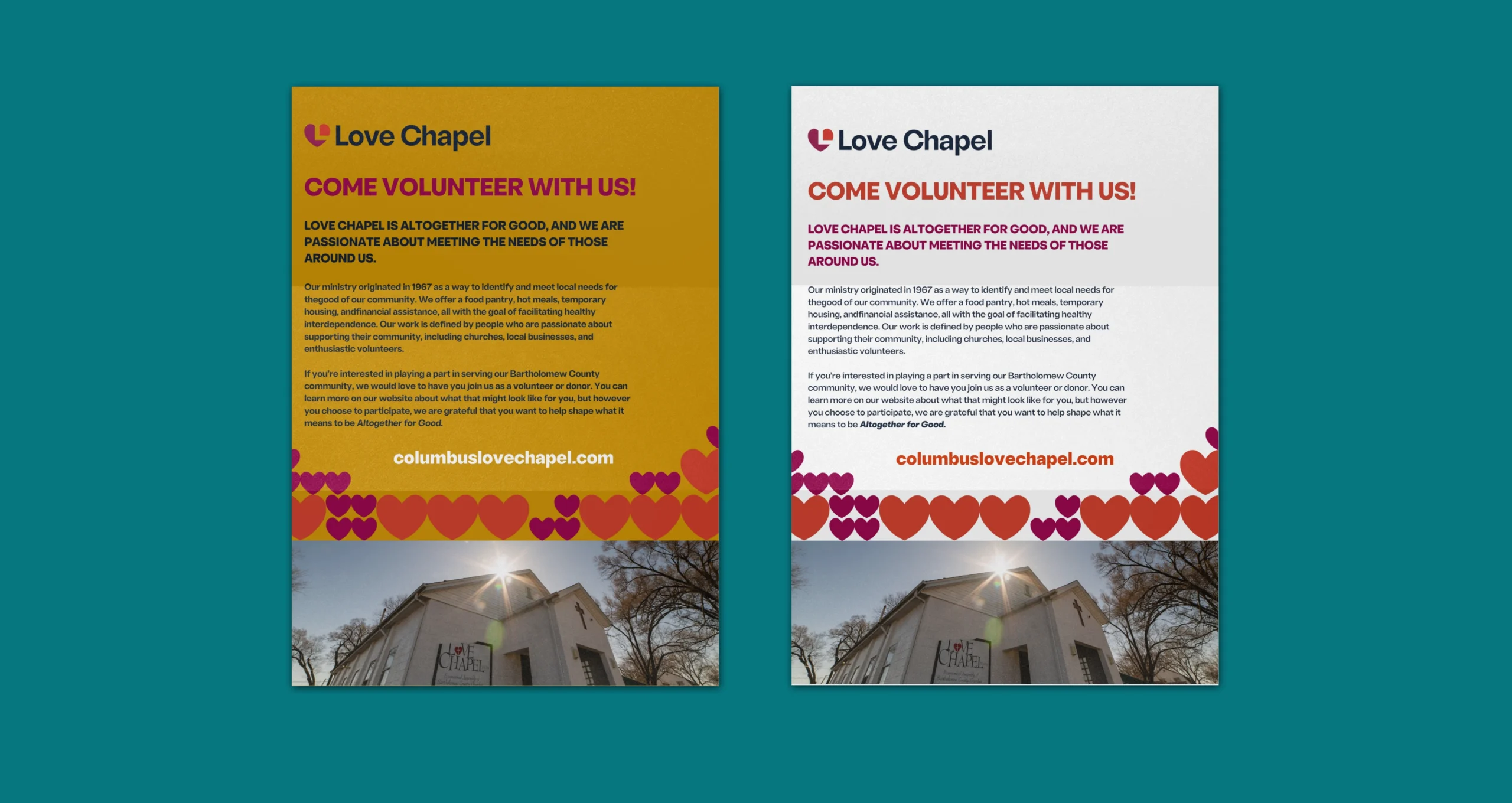
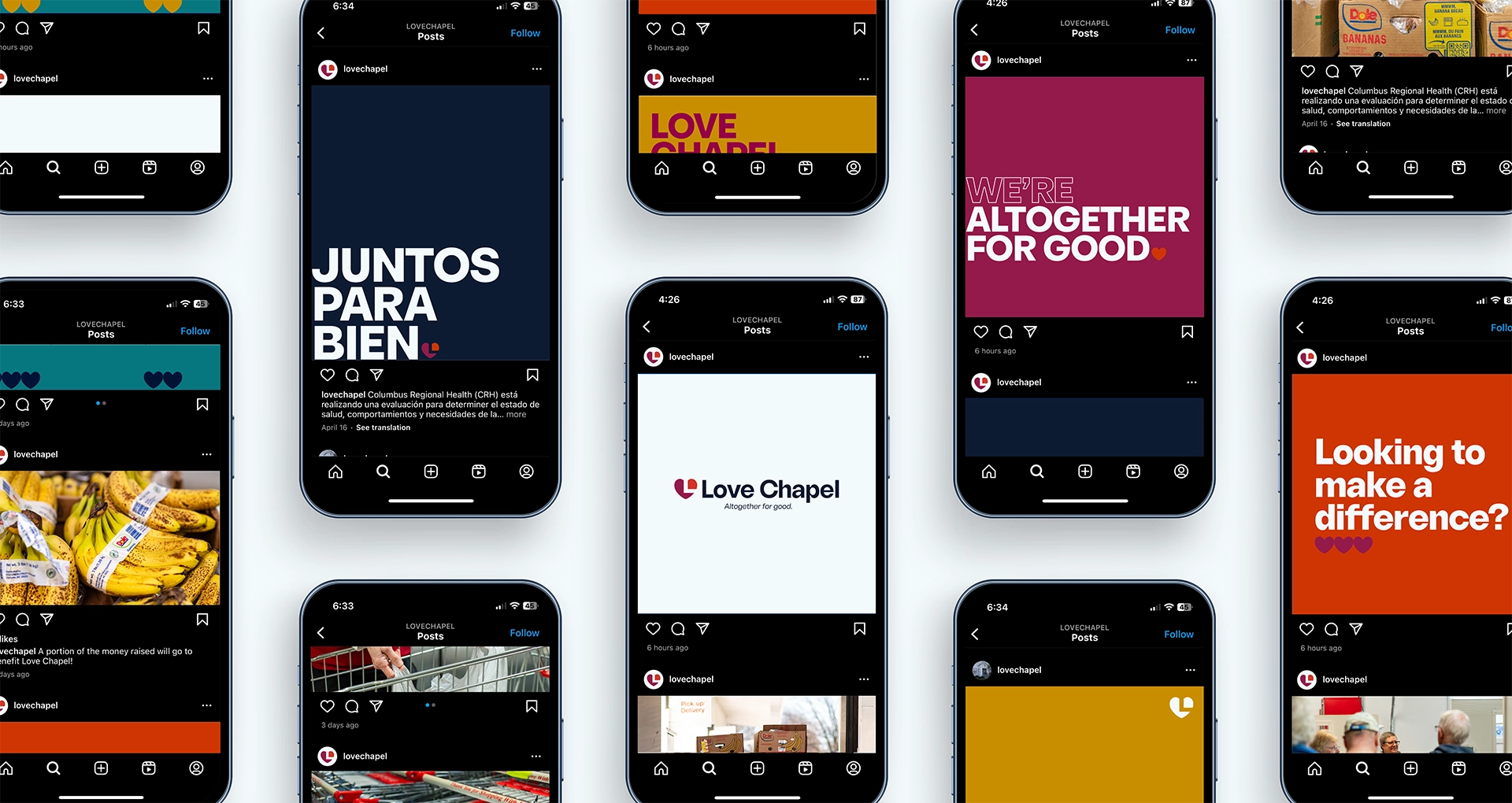
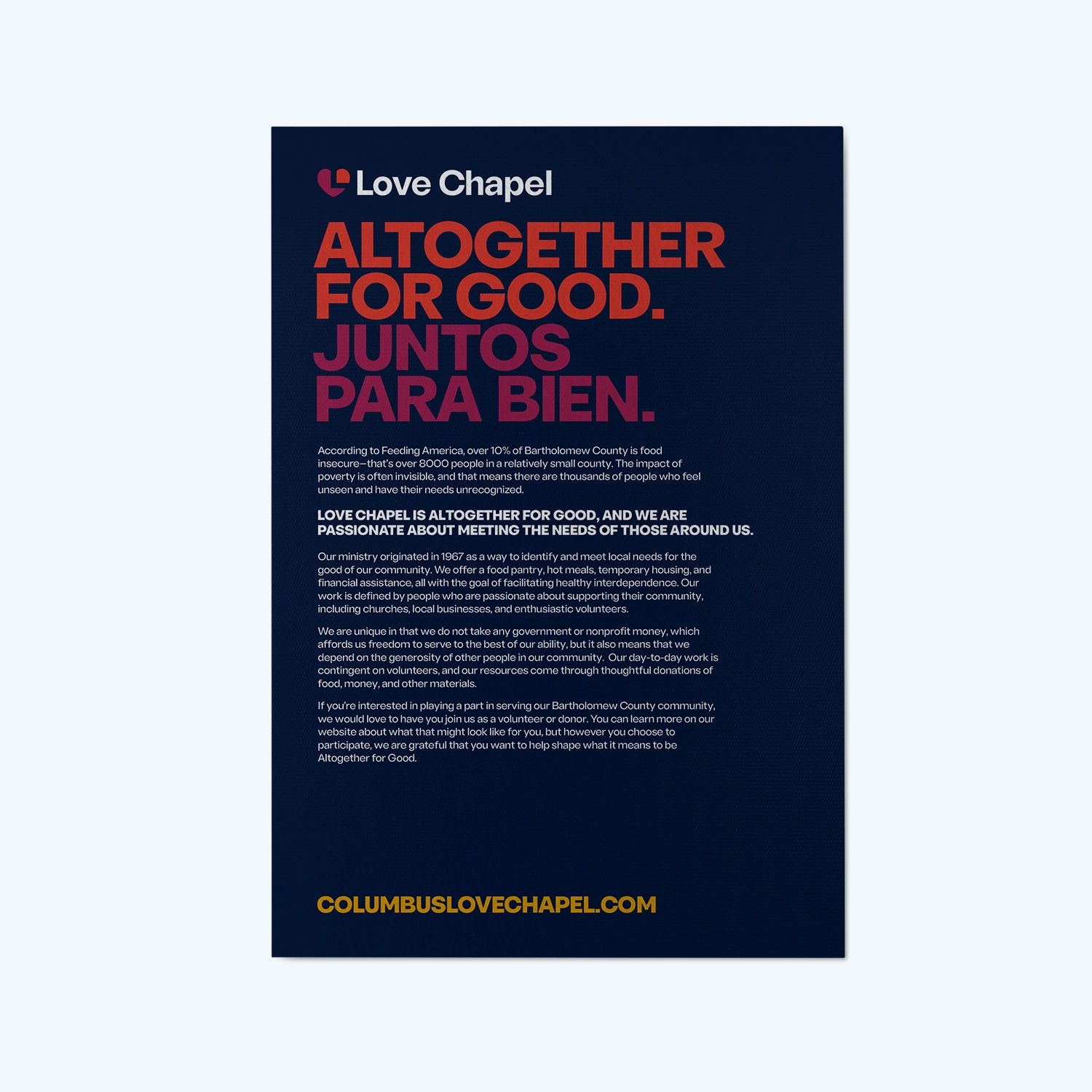
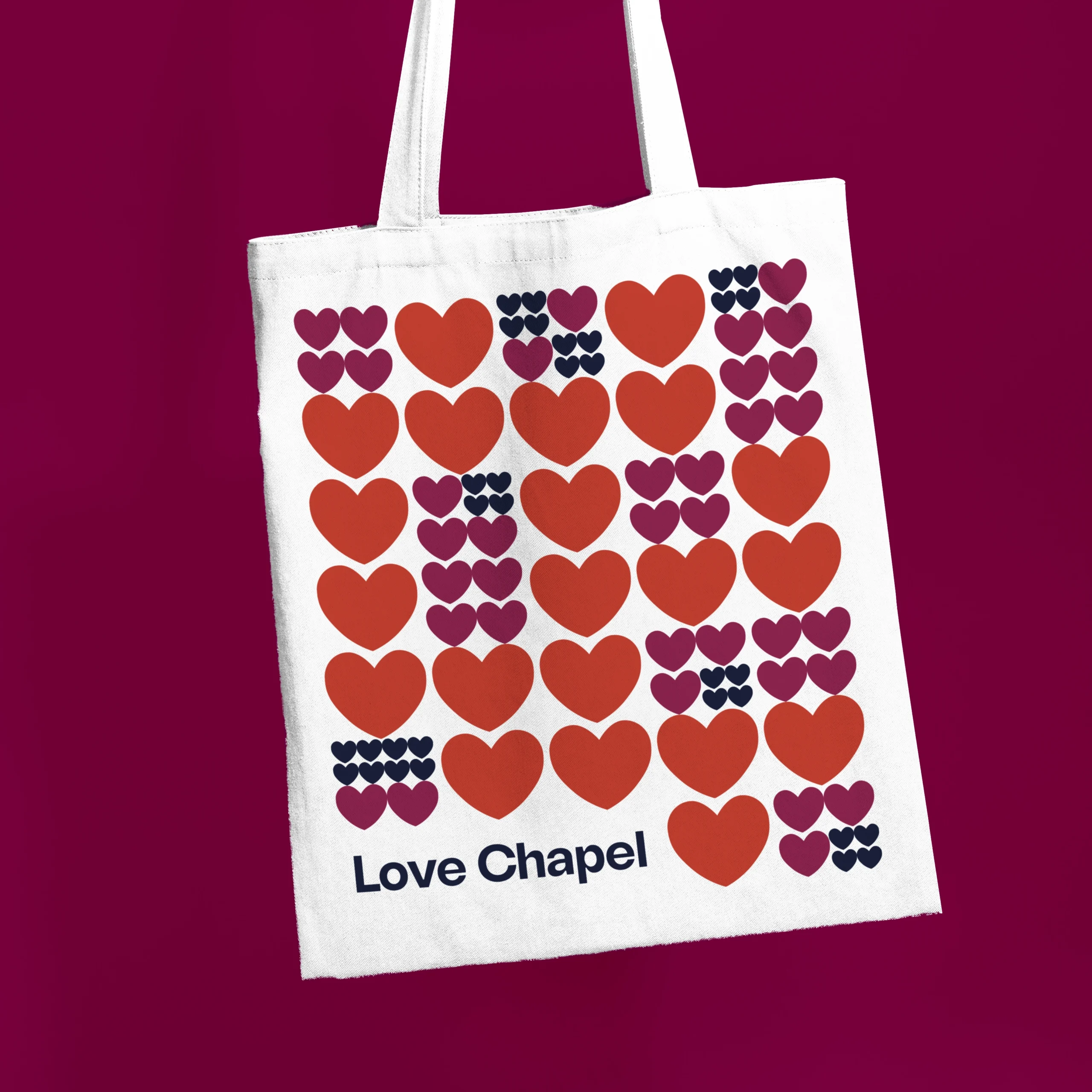
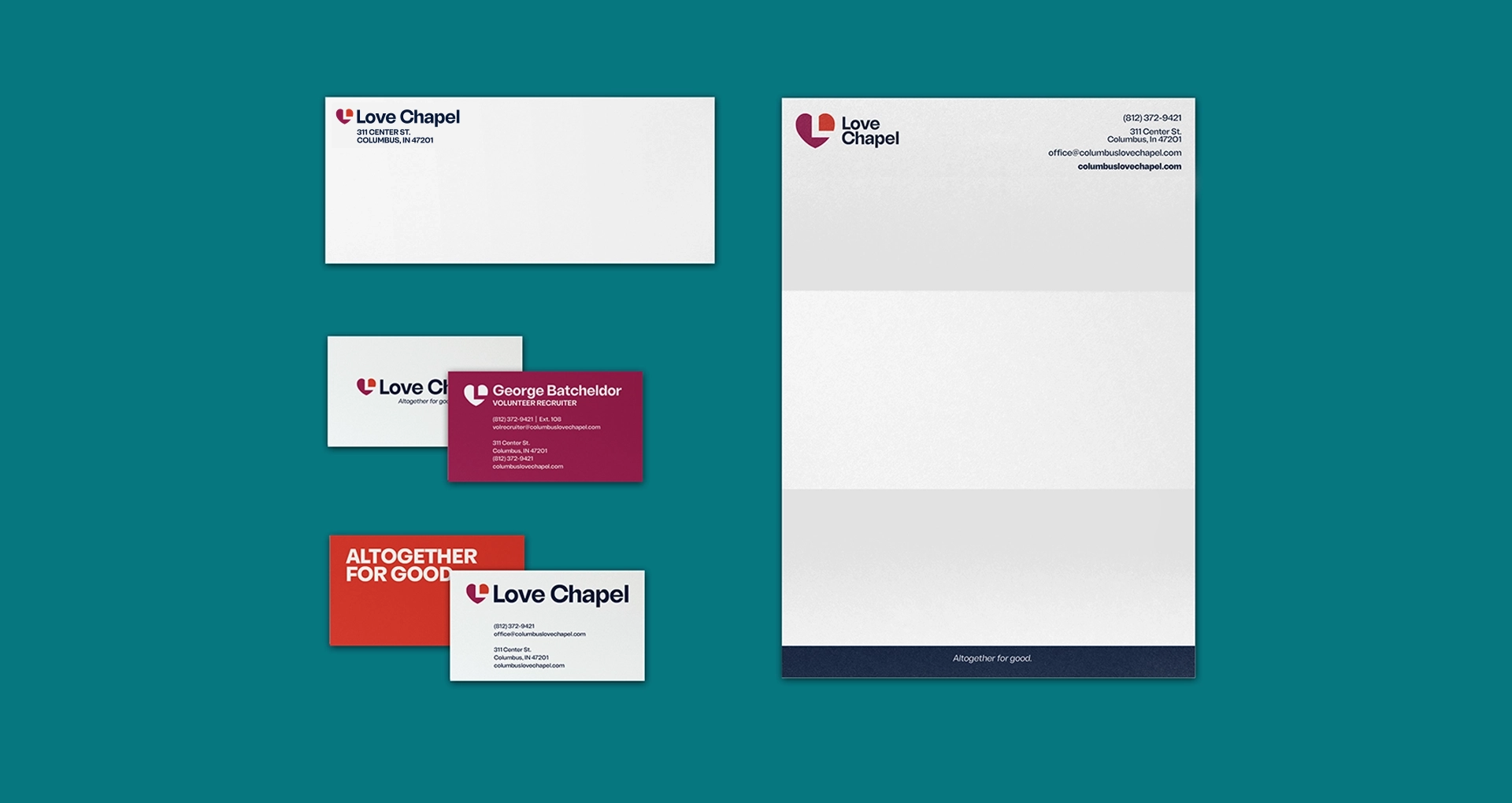
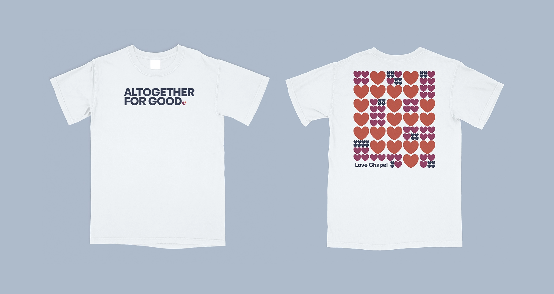
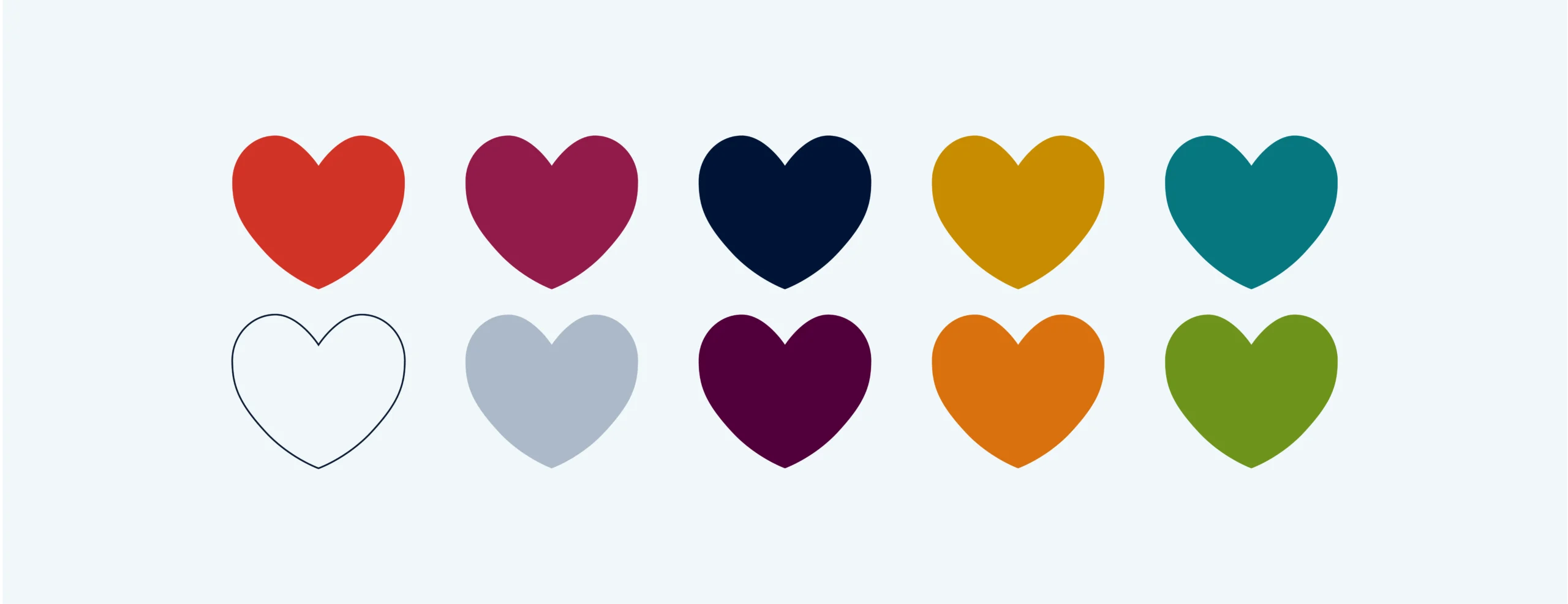
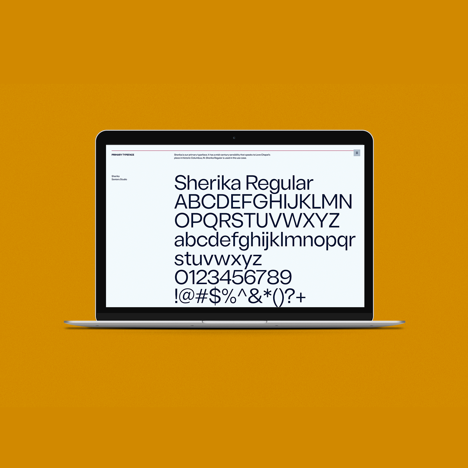
For the brand itself, we wanted to create something that felt as warm as the Love Chapel Staff. We developed a color palette that uses vibrant, inviting colors that allows anyone to feel welcome and to leave behind any shame that one may have felt. These colors we incorporated evoke warmth and the sense of belonging that Love Chapel hopes to inspire–everyone is welcomed here. The dynamic pop of color signifies how people from all backgrounds and walks of life are invited to interact and create the synergy that Love Chapel encourages.
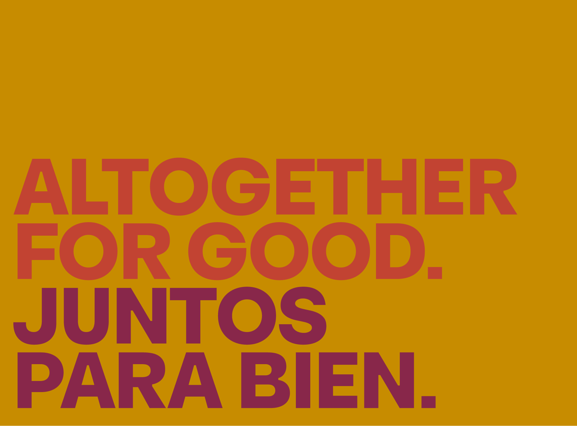
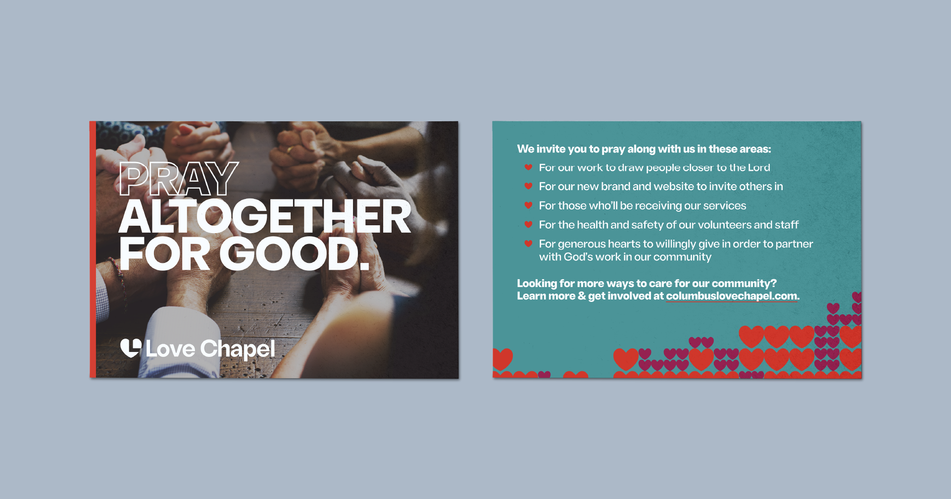
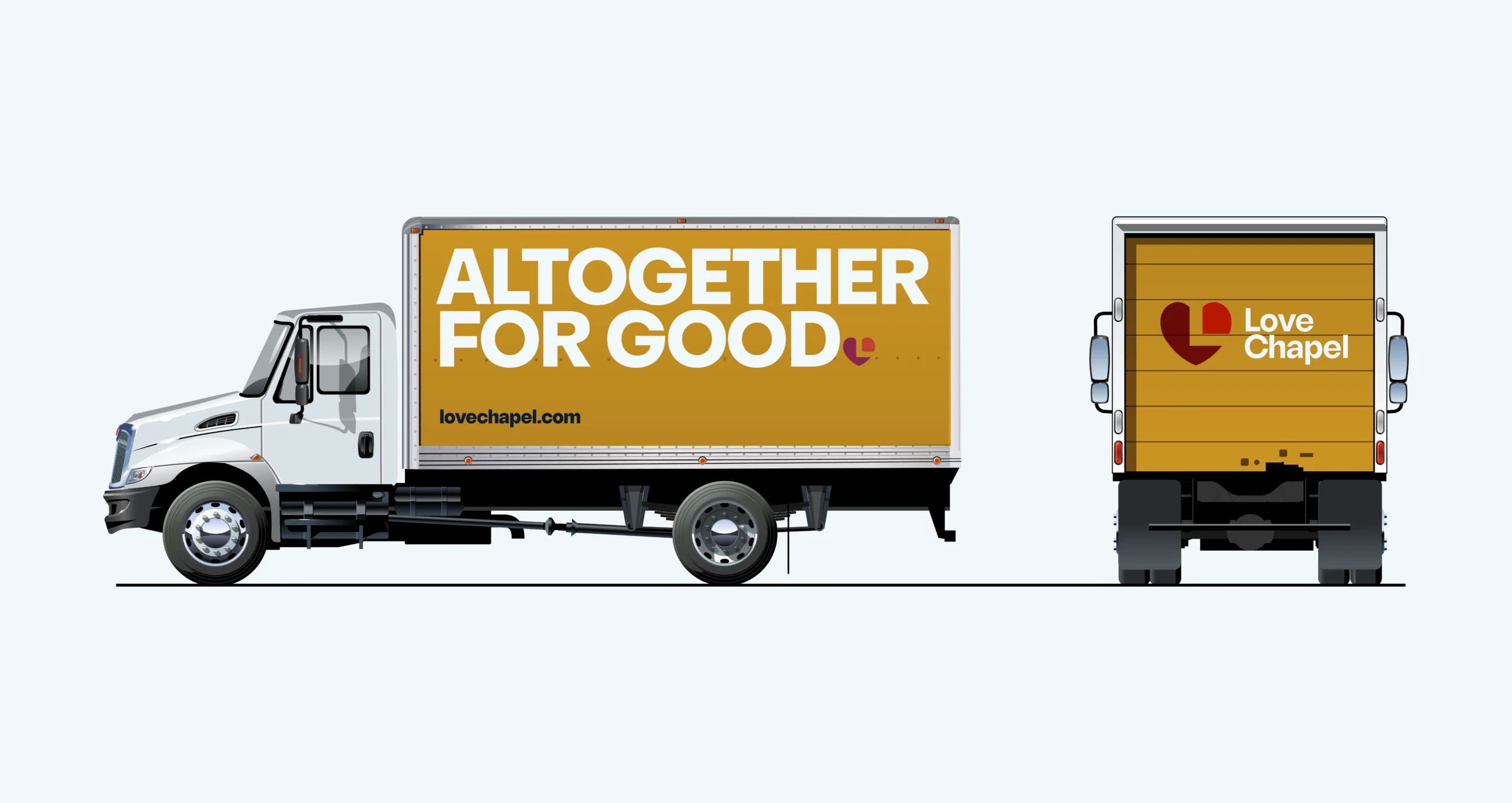
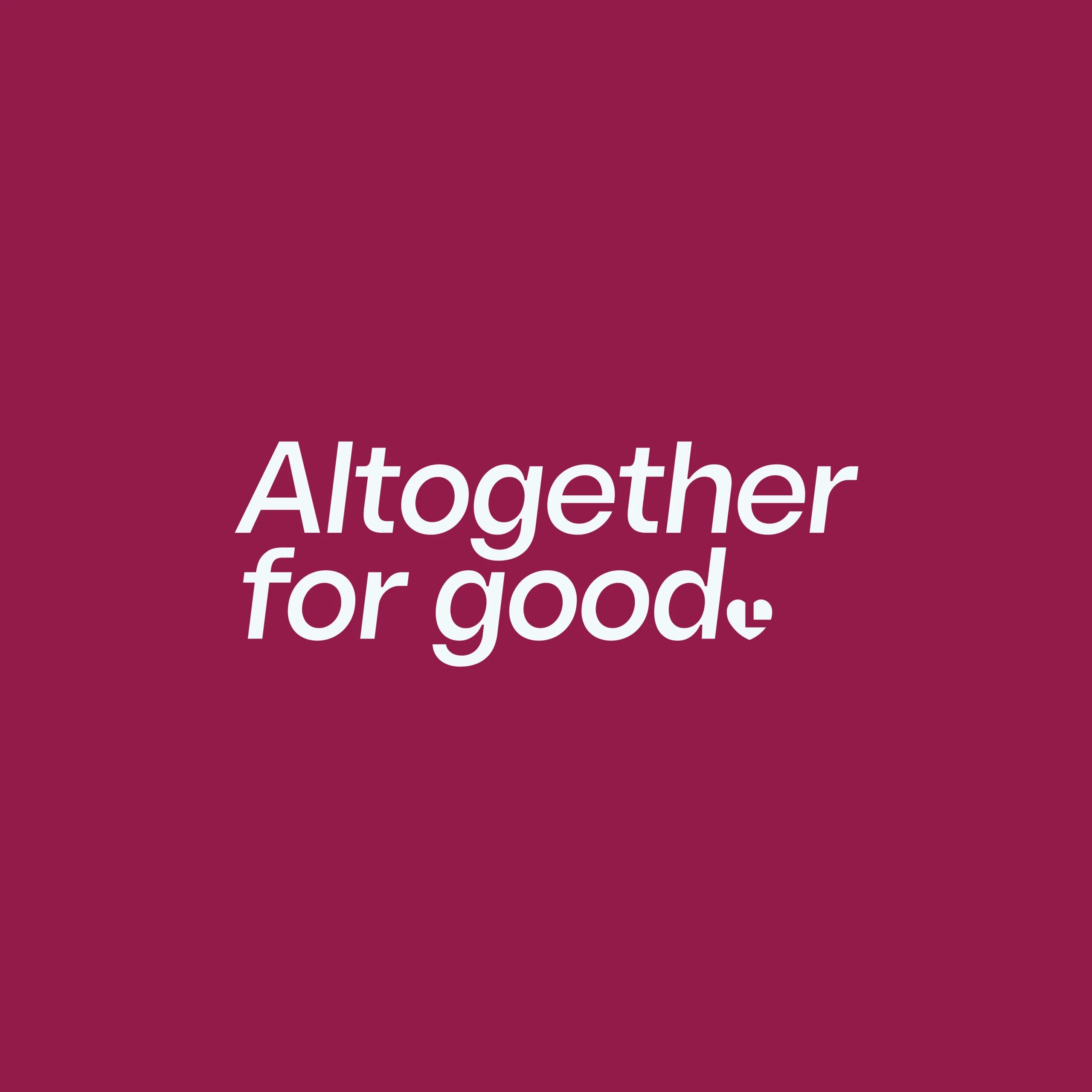
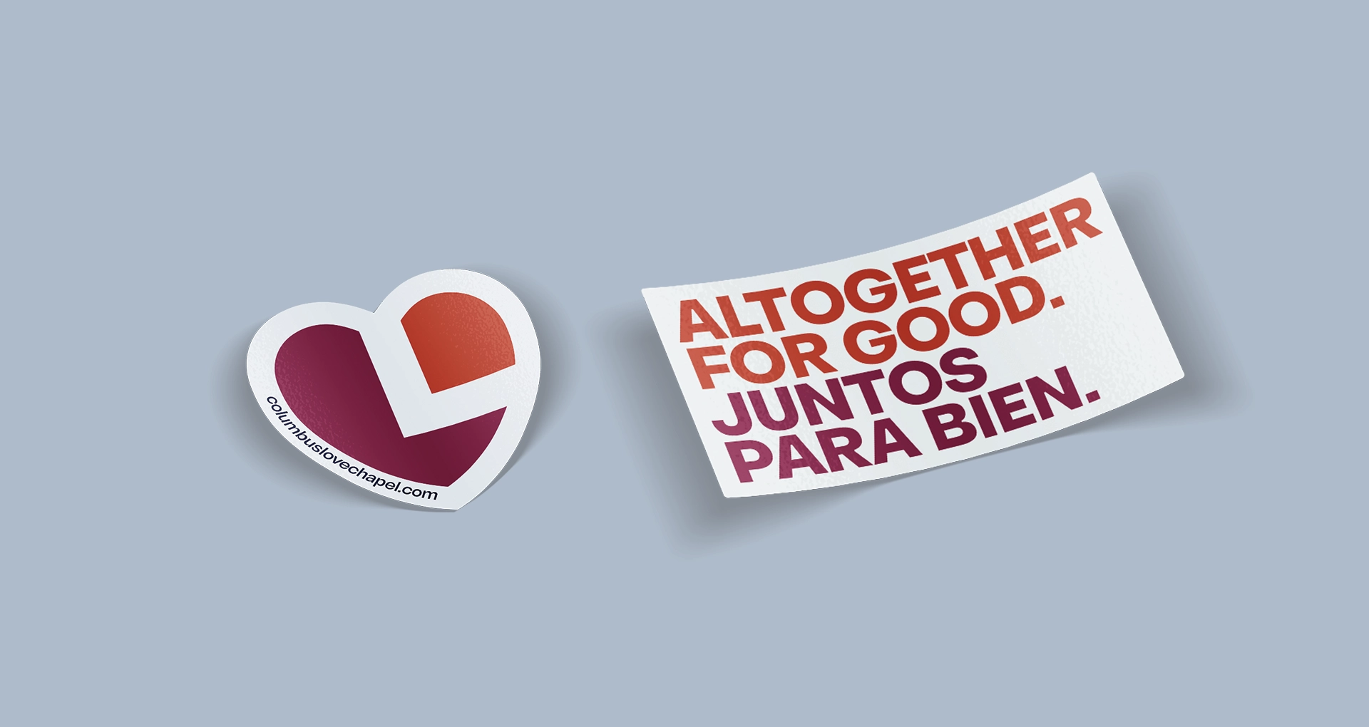
For Love Chapel, these deliverables were only part of the big picture, as we developed the vision of how the new website could further establish the organization’s place in the community. With this in mind, we created a new tagline: “Altogether for Good.” This phrase has two meanings. As a staple of Bartholomew County, Love Chapel is known for their motivation to enrich their community—they are completely, or altogether, driven by the wellbeing of others. Similarly, they are united—all together—by countless volunteers and neighbors who are passionate about their cause. Anyone who interacts with Love Chapel knows they are being invited into something meaningful.
Working with Love Chapel was such a joy for us as they were ideal, collaborative partners who were eager to cast their vision with us, which allowed us to be in a constant conversation over how to best meet their needs. Because Love Chapel is such an established community presence, getting unified brand approval from a large board with over thirty people proved to be a meaningful challenge that helped us to solidify and strengthen the new brand even more than before, as we had to clarify and refine exactly what they wanted to communicate. While the process was time consuming, it was well worth it as it allowed us to build trust with the board to ensure that everyone was onboard to make big, strategic decisions throughout the project. It’s exactly why we love our work: on paper, it sounds like a simple nonprofit web design project, but in reality, it’s an opportunity to build relationships that strengthen other relationships. We truly enjoyed the opportunity to come alongside Love Chapel’s staff team to walk through the new brand vision and strategy.
