When you picture well-being, what do you see?
This is the question that animated our work with Northside Pediatrics, a well-loved medical practice in the heart of Columbus, Indiana.
This is the question that animated our work with Northside Pediatrics, a well-loved medical practice in the heart of Columbus, Indiana.
Founded in 1972, Northside Peds has cultivated a long history of providing excellent medical care for children, teens, and families, but it's not just about the medical care—the doctors and staff at Northside Pediatrics are known for their playful attitudes and warmth with patients.
As the practice grew and expanded, Northside eventually had the opportunity to design and build a new office building. With this move, they wanted to start fresh with a new logo and brand that would more accurately reflect their practice and values while preserving their legacy of care.
As the practice grew and expanded, Northside eventually had the opportunity to design and build a new office building. With this move, they wanted to start fresh with a new logo and brand that would more accurately reflect their practice and values while preserving their legacy of care.
The picture of health
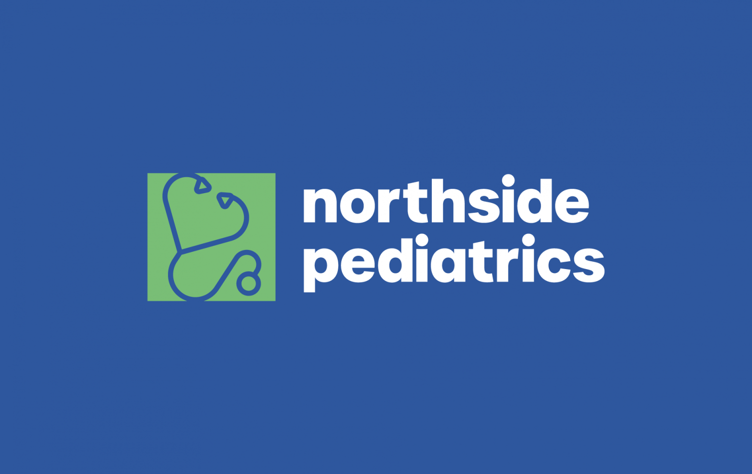
When Northside Pediatrics approached Amenable, their logo was showing its age. The image depicted a child kissing another child on the cheek, and while it was cute, it didn’t feel meaningfully connected to medical care. Furthermore, in a post-COVID climate, it felt like there had been a cultural shift in how people view health, and we wanted to reflect that in a new logo. We started with a dynamic color palette to evoke the enthusiasm that children naturally possess. If you’re a kid—or an adult, for that matter—doctors’ offices can feel scary, so we wanted to move away from hospital sterility and toward the idea that good health is holistic—it’s vibrant.
With that spirit in mind, the new logo depicts a universally recognizable symbol—the stethoscope. If you ever pretended to be a doctor as a child, you know the thrill of hearing a heartbeat for the first time and realizing that your body is alive with its own rhythm. The image also subtly hints at the way that the Northside practitioners listen to their patients.
Finally, despite the radical redesign, the new logo maintains echoes of the original by forming the shape of a heart, recalling the love implied in the old logo. For the wordmark, we chose a playful, lowercase sans serif font to further emphasize the childlike joy found throughout Northside Pediatrics.
Keeping it in-network
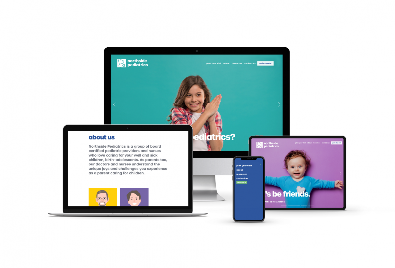
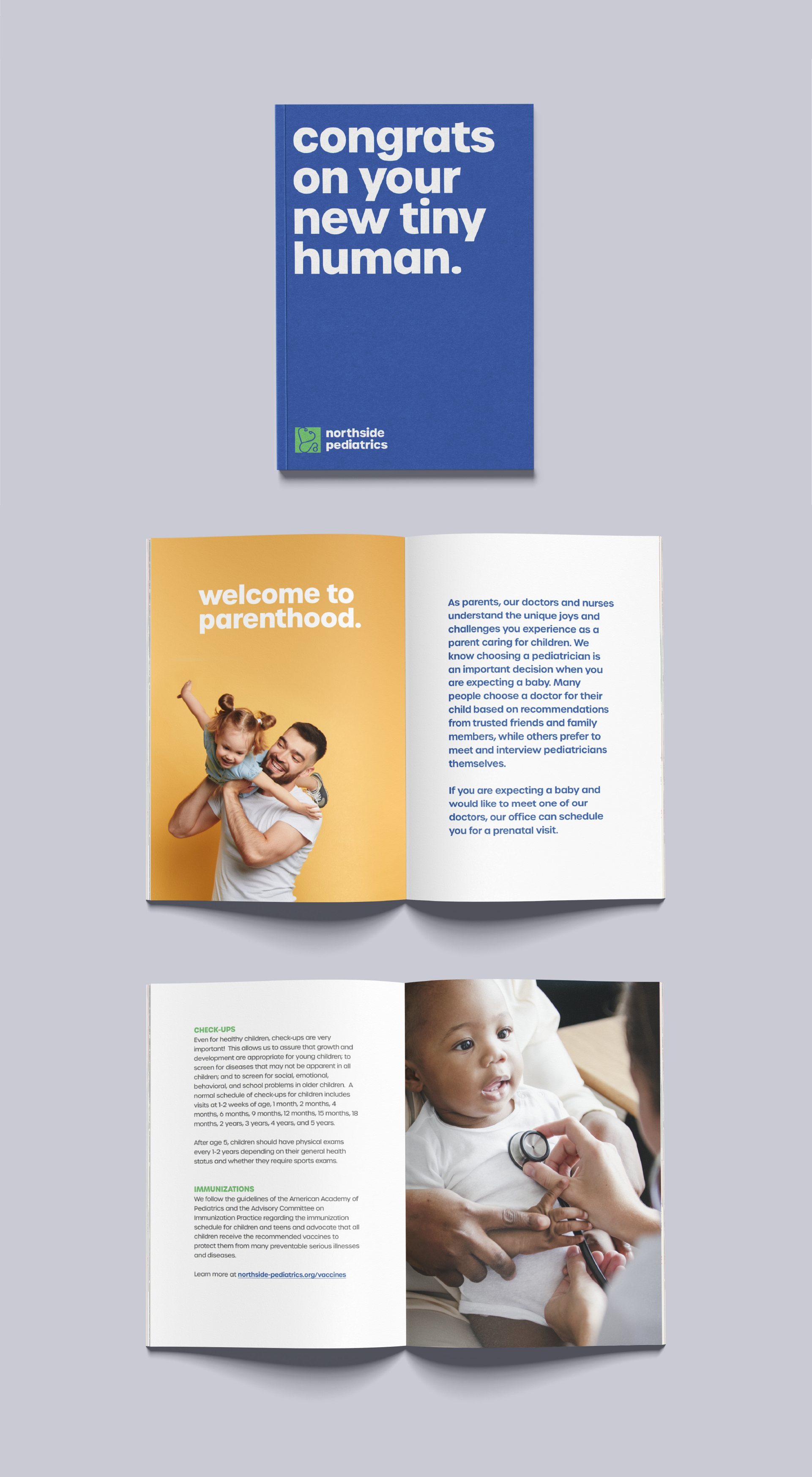
The logo itself was just the start. We redesigned their website to prioritize easy access to the information that parents would care most about, such as bios about each doctor and instructions for how to schedule an appointment. For each doctor, we made a cartoon-like illustration of their headshot so that patients would feel more comfortable meeting them. Throughout the site, bright colors suggest that a trip to the doctor can be exciting. Alongside these fun, stylistic decisions, we also knew that it would be important for Northside Pediatrics to showcase its expertise, so we created a landing page with blog posts about key childhood development milestones, and we made it easy for staff to add new content when they felt it appropriate. Additionally, we built a page that offers all of the nitty-gritty forms in one space, simplifying the registration process for new patients.
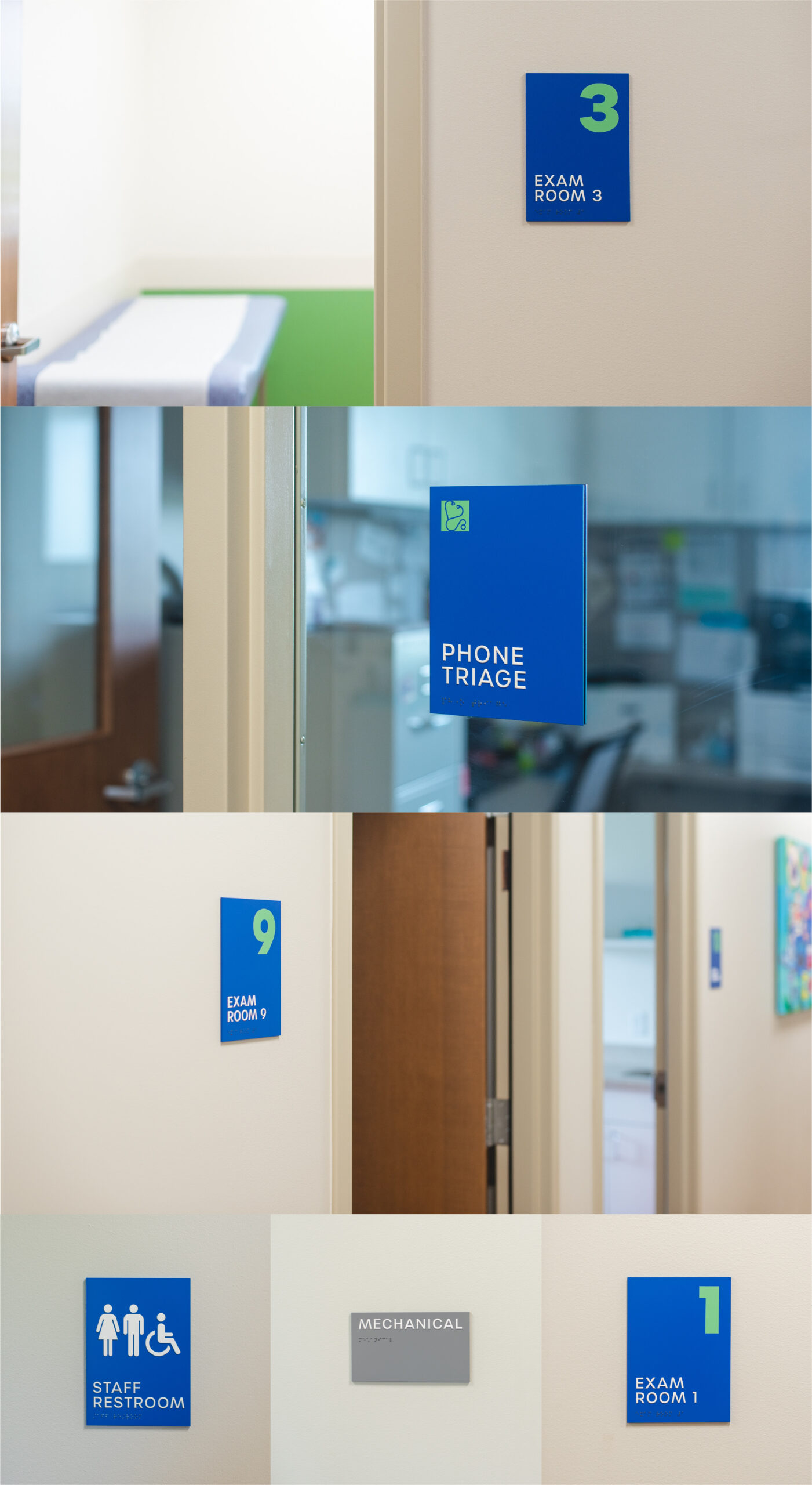
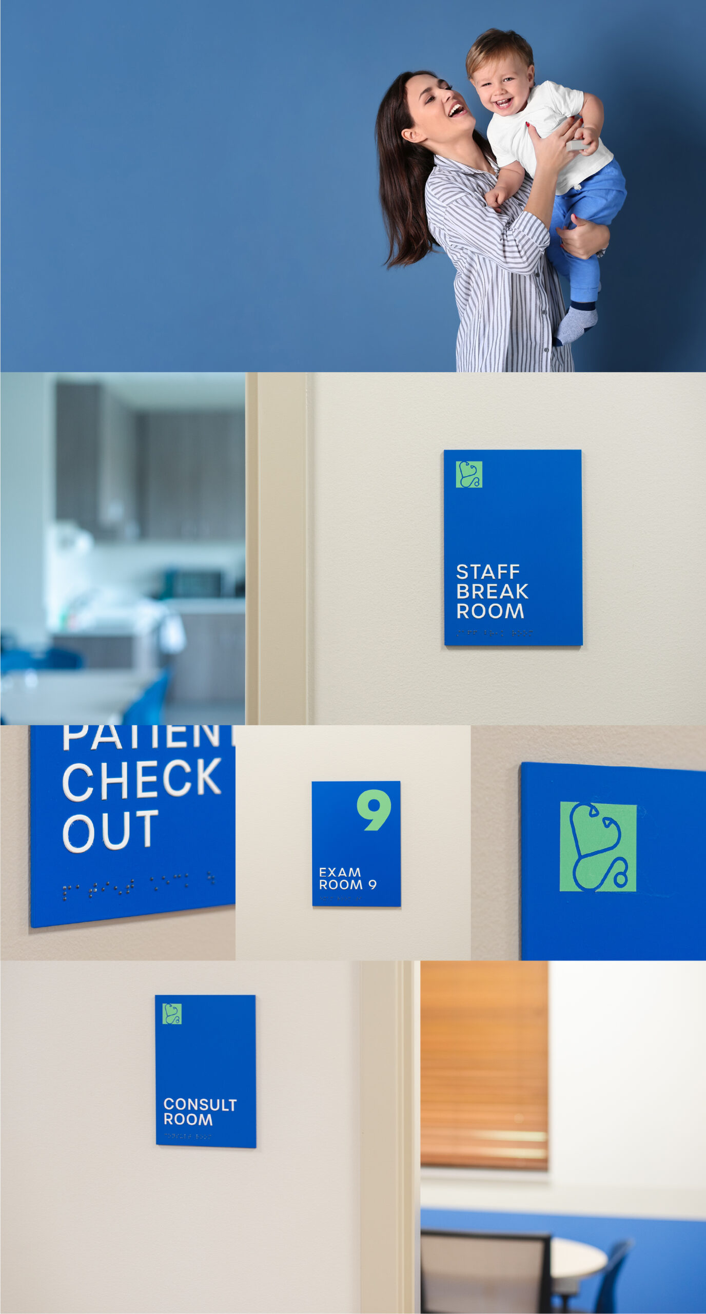
Checking all vital signs
Finally, we started thinking about how this brand might live in actual space. The practice’s old building was rented, but because they were designing their new building, it was a perfect opportunity to set a new tone. Instead of pale, medical grays, we brought bright blue and green to all of the ADA-compliant signage. Rather than allowing a waiting room to be an intimidating space, we ensured that it would feel non-threatening and comfortable to all visitors.
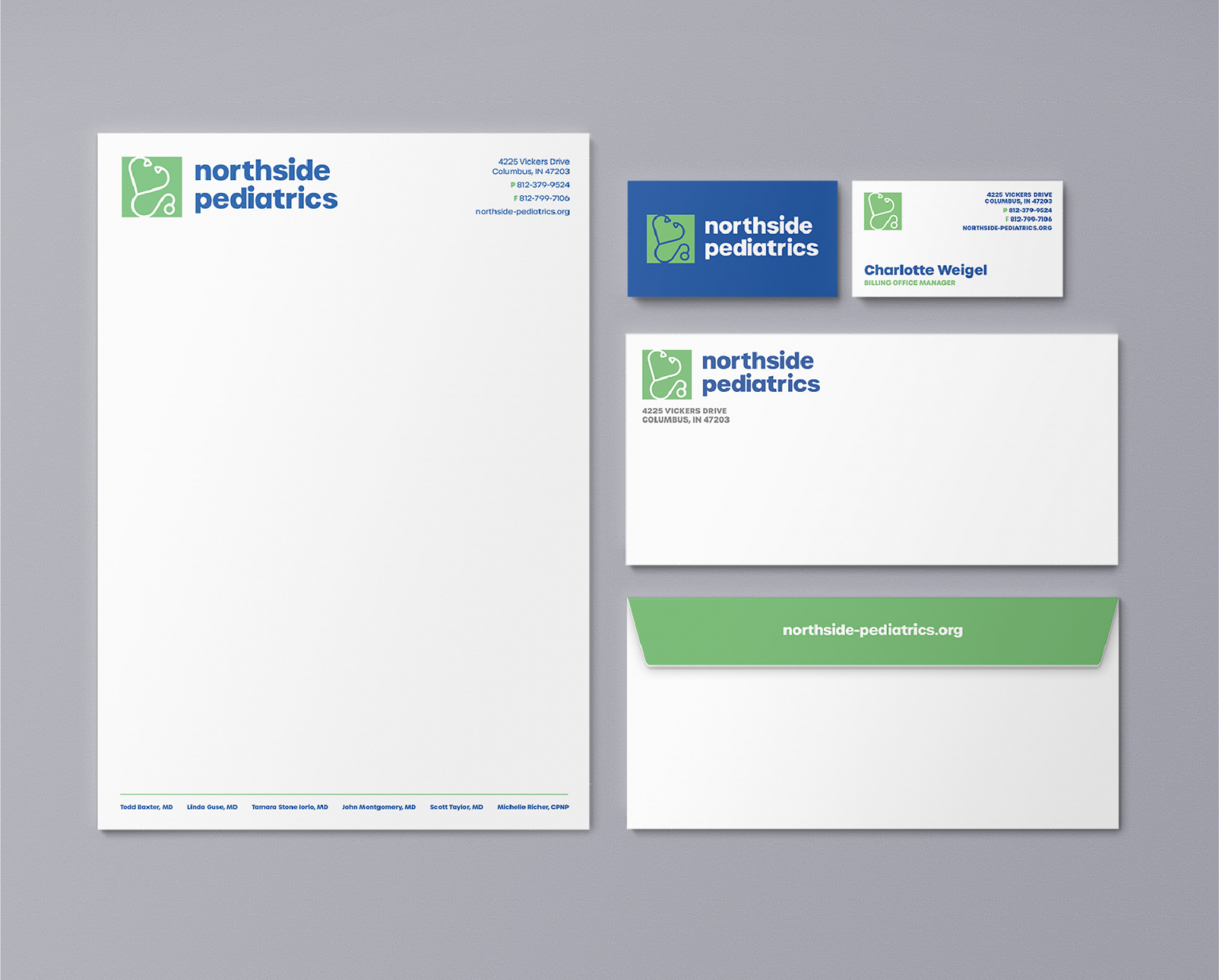
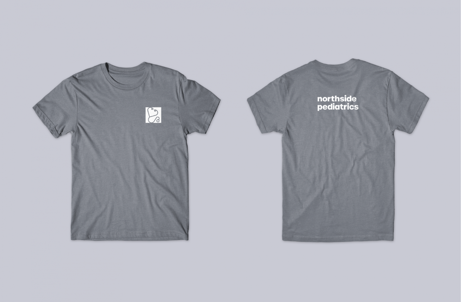
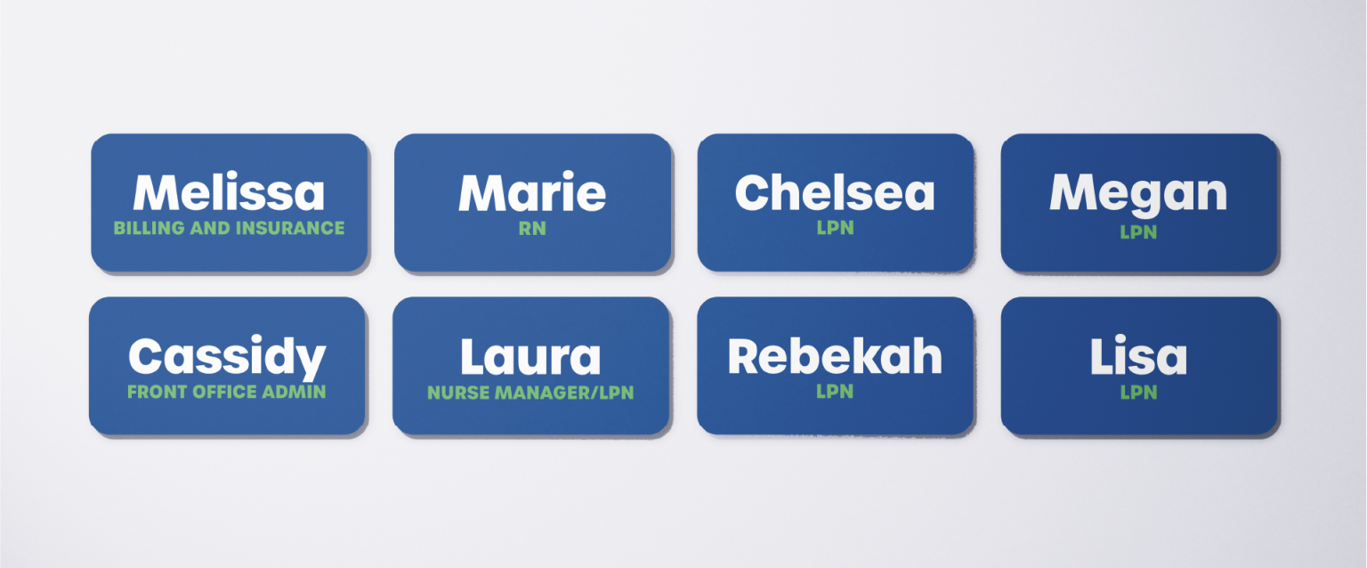
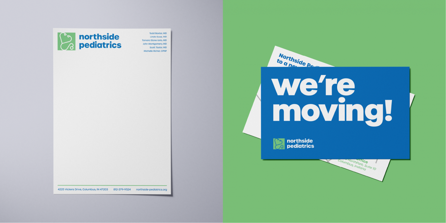
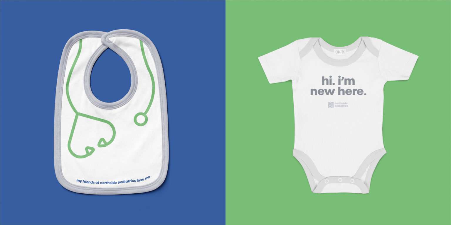
Along with all of the signage, the launch of the new location offered an opportunity to create some new collateral—the fancy design term for “merch.” This included new nametags with each staffer’s role, playful birthday mailers for each patient, appointment reminder cards, and stationary. Our personal favorite, however, was the selection of clothing for adults and children alike. For staff, we made bright t-shirts using colors from the Northside palette, and for kids, we made onesies and even a bib! At first glance, it might sound like a lot, but if going to the doctor is viewed as part of a healthy lifestyle rather than an unpleasant necessity when one is sick, then all of these little things add up to one big thing—a clear and cohesive brand.
Using the move to the new building as a launching point, we worked to bring enthusiasm and excitement to Northside’s providers, patients, and families. Our work made Northside’s brand a more accurate representation of who they are, and we also helped them implement this brand into each aspect of their practice. From the signs to the website, current and prospective families encounter a warm and playful brand that eases anxieties, invites joy, and communicates care. For the Amenable team, we can’t imagine a more worthwhile goal than making sure that every family feels safe and supported as they step into the waiting room.


Want a behind the scenes look at this project? Check out the comprehensive project case study below.