For new projects & collaboration opportunities:
Say Hello
For insights & ideas:
Sign up for our newsletter
For good vibes:

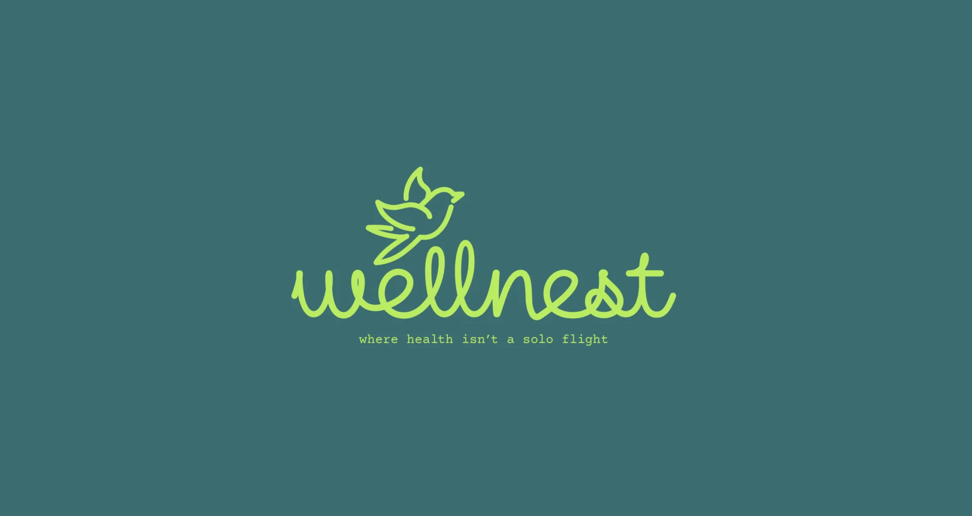
That imagery perfectly captured Suzanne’s personality and approach. We chose a swallow for the logo—a symbol of new beginnings, hope, determination, and joy. The name transformation shifted everything: instead of focusing on who clients will become, Wellnest honors the journey toward who they're becoming.
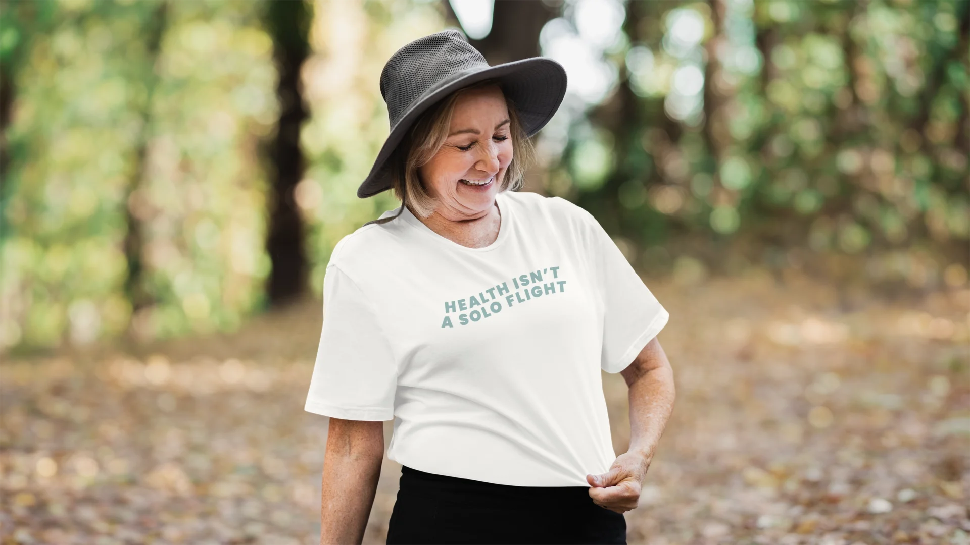
The swallow logo reinforces this hopeful narrative, encouraging clients to feel grounded and supported as they move forward. When Suzanne mentioned she could envision the logo on a hat someday, we knew the vision had truly resonated. The possibilities felt real, tangible, and authentically her.

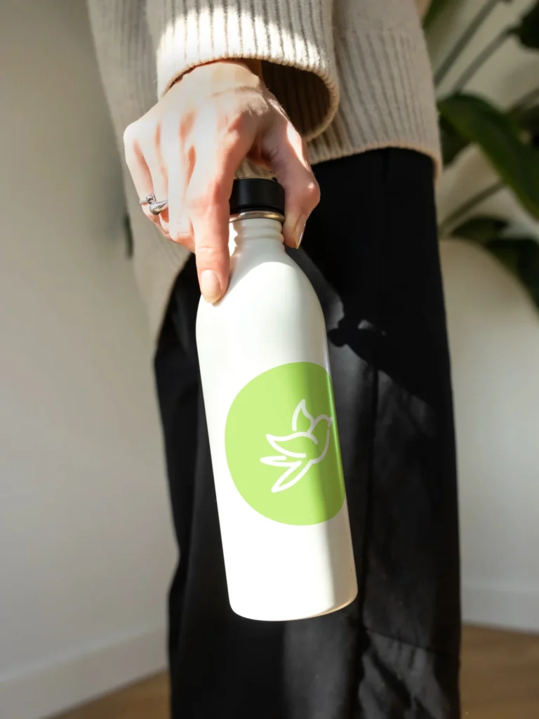
We balanced that gentle symbolism with a color palette that bridges Suzanne's dual expertise—holistic warmth and scientific clarity. Bright greens represent growth and renewal, while purples evoke wisdom, intuition, and peace. A grounded neutral brown conveys resilience and safety, complemented by soft blue-green tones that radiate calm.
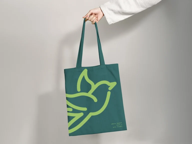
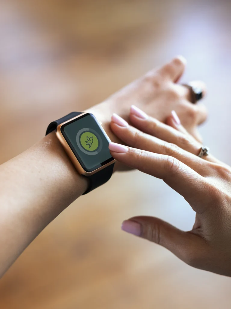
Instead of a rigid one- or two-color system, we created something with movement and spirit—just like Suzanne's certified nurse coaching philosophy. These colors now live across every touchpoint: brand guidelines, social media templates, print collateral, and yes, bringing that Wellnest hat closer to reality.
Beyond branding, our conversations became strategic business sessions. Each meeting included intentional questions that helped Suzanne think through Wellnest's future. We experienced firsthand the same care she brings to her clients, and we're thrilled that we could help make those crucial first impressions easier. To Suzanne, helping clients through certified nurse coaching is a privilege—and we felt the same about helping her achieve her small business goals.