Different Types of Paper for Printing: How to Pick
“Different types of paper for printing will not only deliver your work—they will provide support and develop your design.”
Vanessa Perez
Picture this: you spent weeks developing a project, and you’re finally ready to share your information with the world. You’re excited to share your content with others, but your next step is figuring out how to print your work. Choosing paper is more complex than you may think. There are so many different types of paper for printing, and each offers a unique strength for a variety of purposes. With so many options, it’s important to make the right choice for your project. So where do you start? Let’s talk paper.

Different Types of Paper For Printing: Five Key Components
Consider the Impression You Want to Convey
Let’s get planning! When you’re looking at printing options, a question you should be asking yourself is: What impression do you want to leave? Various types of paper speak on the behalf of your projects, so you don’t want to broadcast mixed messages.
Let’s use an example for clarity. If you represent a business who is expressing concern for environmental issues, you wouldn’t want to select luxury papers for printing. You can make a statement by choosing paper made out of recycled content instead. Recycled paper has lower paper brightness and texture that communicate a sustainable feel. These factors will prove more beneficial to your mission than an impressive premium paper. Additionally, if nonprofits are inquiring about financial support, supporters may be more reluctant to aid organizations that print on premium stock. Premium paper can give the impression to others that the organization is well-funded and less likely to need the financial support.
Do not deliver mixed messages, but strengthen the image you portray by choosing the right printing stock.
Choosing Your Paper’s Brightness
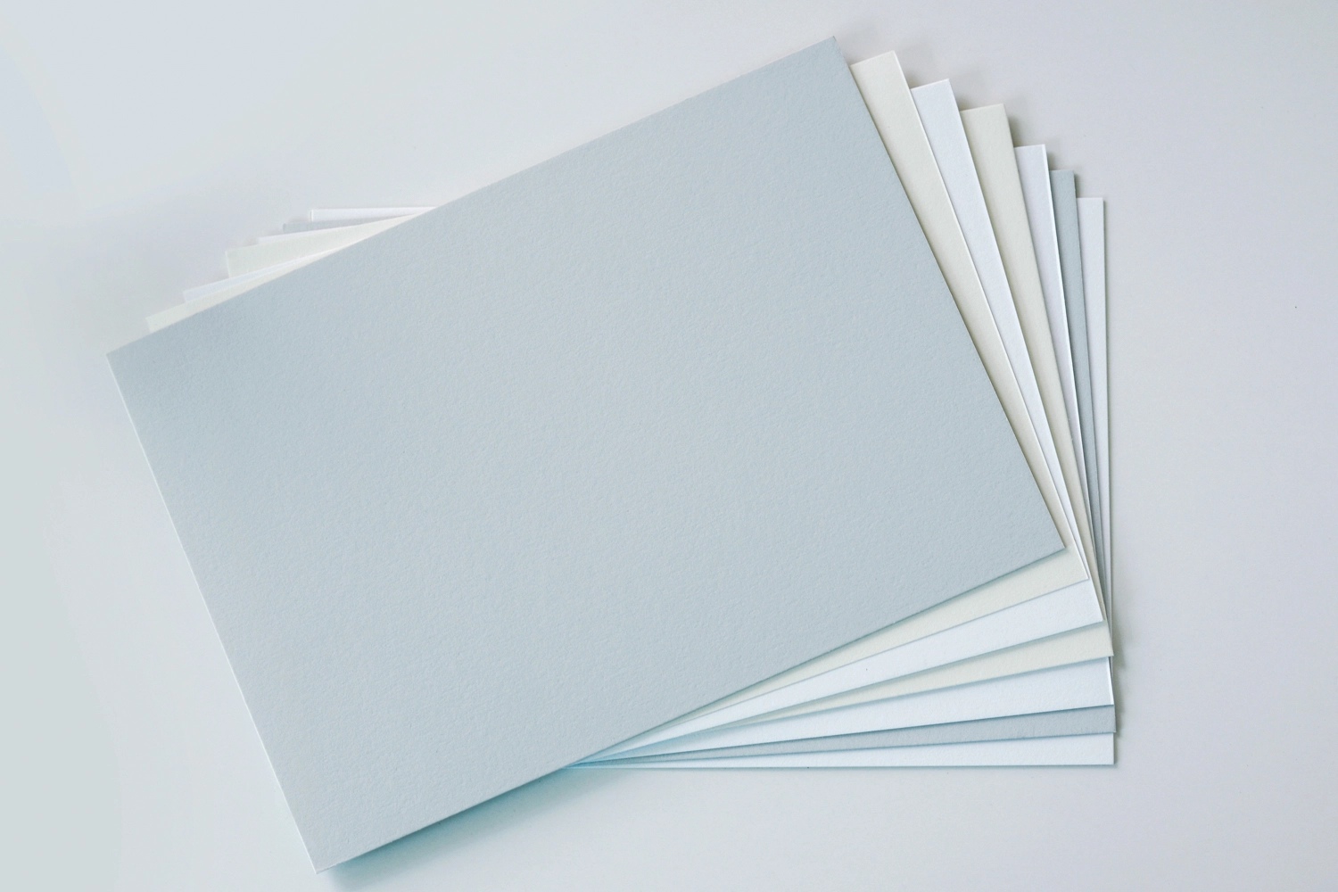
What color is white? If you’re not a designer, this feels like a trick question. With a trained eye, however, designers can inform you that there are many variations of the color white. Printing paper can come in blue-white, balanced white, natural white, soft white—you name it. Different types of paper for printing hold different brightness levels that impact the appearance of a printed project. If you’ve ever printed a bright design, only for it to look drab on paper, this might be why. A paper’s brightness should equally be considered when you are searching for the ideal paper for a job.
A paper whiteness or brightness is measured by the reflectance of blue light wavelengths on a page. Blue light wavelengths are scaled from 0-100, with 100 appearing as the brightest to the eye. It makes sense to always choose the brightest, right? Well, not quite.
Each white fits a purpose. They affect the graphics produced on them. Colors like blue-white are used frequently because their higher brightness allow colors to stand out. Although you want certain colors to pop, printing skin tones on blue-white paper will make individuals look gray. For graphics that showcase people, printing on paper with a warmer white will make your images look more lively. Warmer whites are typically made with lower brightness, which is relaxing to the viewer’s eyes. This lower brightness makes this type of paper perfect for reading or extensive viewing. If this still feels confusing, think of the difference between reading on a laptop screen compared to your Kindle. It can reduce your eye fatigue, sure, but it also impacts how you feel about what you’re seeing.
Choosing Paper Color
If you want to experiment with color paper, first start with researching the effects each color can have on your graphics. Colored paper can enhance the appearance of the printed text and images. How? If you were to print blue ink on an ochre-yellow sheet, the image would look green. To avoid this change in appearance, some mills provide promotions that show precise colors when you print in their color stock. Be sure to ask for sample printing to see the full extent of the mill’s color services.
Be sure to research if the mill you are planning to do business with provides services that allow you to see the color of your printed work.
What is Your Paper Finish?
A paper finish is the surface or texture of a sheet of paper that affects the appearance and feel of the page. Some of the most widely used finishes are: coated, uncoated, smooth, embossed, and recycled. Different types of paper for printing will complement the design and its purpose in your project more than others, and this is often most obvious with a paper’s finish.
A glossy finish is best used for photos and images, as the colors are more vibrant with a greater contrast. Glossy finishes are also great for projects like take-out menus or event programs. Although glossy finishes are beautiful, one should be aware glossy paper can be difficult to write on with pens or pencils. Projects such as forms or applications should not be printed using glossy paper finishes. If you’re interested in learning more about the variety of paper finishes available, check out this article for an in-depth explanation: Types of Paper Finishes and When To Use Them.
Watch the Weight of Different Types of Paper for Printing
Now that you have established which finish and color paper you want for printing, it’s time to choose the weight of the paper. The thicker the paper stock, the heavier the weight of the paper will be. Different types of paper for printing can be weighted between 16 to 140 pounds depending on the material the paper is made from.
Bond paper is standard paper used for copiers and printers in offices. Bond paper weight is around 16 to 36 pounds.
Text paper weights are used for commercial printing as the paper is featured in stationery and letterhead projects. Common text paper weighs between 50 to 100 pounds due to its thickness and sturdiness. Here are some examples of frequently used Text paper weights:
- 50 pound text paper: Most documents and softcover books.
- 70 pound text paper: Comic books and certain catalogs.
- 80 pound text paper: Prints such as magazines, lighter catalogs and large textbooks utilize this paper.
- 100 pound text paper: Typically children’s books, comic book covers and brochures.
Although there are many uses for text paper weights, other types of paper stock may help enhance your project.
For example, cardstock weighing 65-pounds is used for greeting cards and posters. Heavier stock such as the 80-pound cardstock is used for business cards, postcards, invitations and heavier posters.
Another kind of paper, bristol, originated in England when paper was made from rags. Bristol paper is extremely thick and heavy mainly used for wedding invitations as it can weigh from 67 to 120 pounds.
Index paper is, as you may have guessed, paper used for index cards. Index paper weights are stiff but inexpensive paper that is available in 90, 110 and 140 pounds.
Lastly is Tag paper. Tag paper is durable paper used for signs and large posters. This paper is present in weights ranging from 100 to 200 pounds.
In addition to picking other elements of your paper, possessing a strategic vision of what you will be using your design for is essential. If your goal is to produce commercial printing, find a text paper weight that fits your type of project. Sending an invitation? An 80-pound cardstock would do the trick, but if you require a sturdier piece of paper, bristol paper is the way to go.

How to pick paper for your print project depends on your understanding of what your project needs and which paper elements will enhance the work.
Different types of paper for printing will not only deliver your work—they will provide support and develop your design. Being able to pinpoint which paper type will benefit you can be hard, but luckily it is something we know how to achieve! Contact us to begin discussing how you might identify the paper for your projects.

