If you’ve spent much time browsing through our case studies, then you understand that brand design is more than just making things look pretty—it’s a mirror of the world around us. Every year, design trends evolve in response to shifts in culture, technology, and the way we all engage with media. In 2025, we’re seeing a fascinating fusion of past and future, as brands look to balance flashy digital innovation with the ever-present need for deeper human connection. Honestly, it’s kind of a vibe.
For small businesses, nonprofits, and churches, keeping up with 2025 graphic design trends isn’t just about looking cool—it’s about making a statement. Your visuals should do more than just catch the eye—they should tell a story, spark something in your audience, and reflect the heart of what you stand for. So, buckle up! Here are five of the biggest graphic design trends of 2025 and why they matter for your organization.
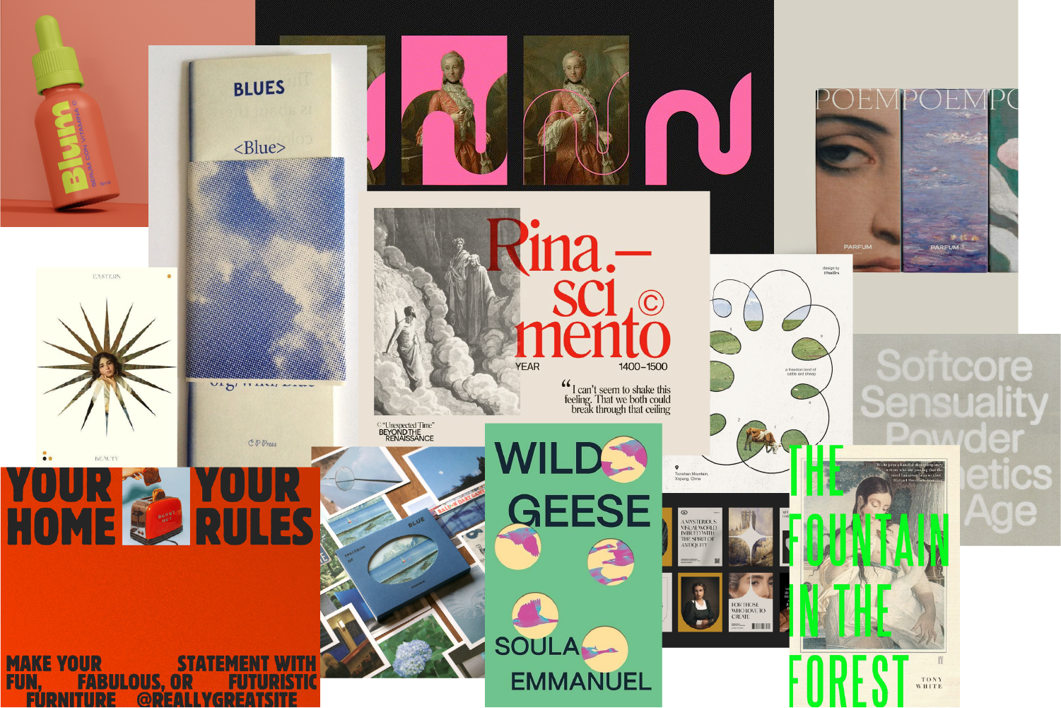
1. Minimalism, evolved
What: Minimalism (at least, as we traditionally think of it) has been in style for a while now, but this year, we’re cranking things up a notch. In 2025, we see a continuation of minimalism’s strong and simple layouts that smartly utilize a grid, but now infused with bold personality—big, striking typography, high-contrast color schemes, and messaging that makes you sit up straight. It’s minimal but far from boring.
Rather than muted colors, vast negative space, and the same tired sans-serif font, we're talking strategic pops of unexpected color that contrast nicely with rich and exaggerated imagery. In 2025, vibrant styling and clean grid structures will go hand in hand to create designs that are simply bold and boldly simple.
Why: The world is loud. Like, really loud. Between constant notifications, TikToks, and “urgent” meetings that could have been emails, our brains are fried. A clean, confident design gives people a much-needed breather and builds instant trust, while still offering details that invite them to linger, discover, and engage.
How: Cut through the noise by using high-impact fonts and strategic pops of color. Consider alternative image libraries (historical paintings or illustrations, public domain offerings, and textured scans are a few ideas). Simplify your messaging to focus on the core idea. With bold minimalism, less is more, but make it loud where it counts.
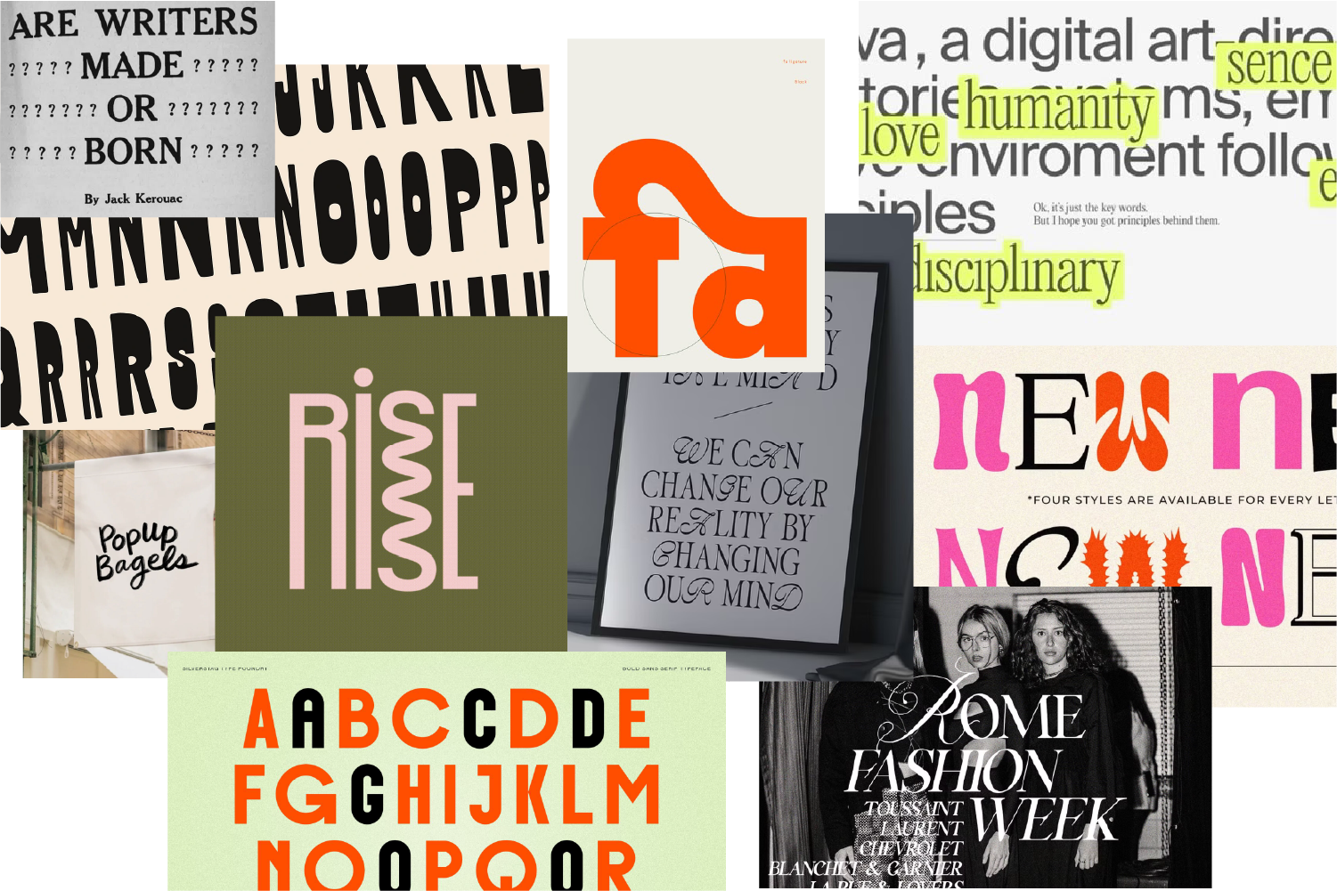
2. Rebellious typography
What: Typography is no longer just about readability—it’s becoming a key visual element in 2025 graphic design trends. This year, we’re seeing brands use distorted letterforms, overlapping text, and unconventional layouts to make words feel more like artwork.
Why: As the pace of the internet only continues to speed up, brands are feeling the need to make an immediate impact. Experimental typography does just that—it grabs you by the eyeballs and makes you feel something. It’s fresh, it’s exciting, and it’s personally one of our favorite 2025 graphic design trends.
How: Think beyond the traditional letterform—get funky with unexpected type combos, exaggerated scale, and textures you want to reach through the screen and touch. Look for ways to make your typography your own by tweaking your x-height, exploring your font’s full Glyphs library, and even designing your own ligatures! But remember, while creativity is key, legibility still matters—make sure your audience can engage with your message, not just admire it.
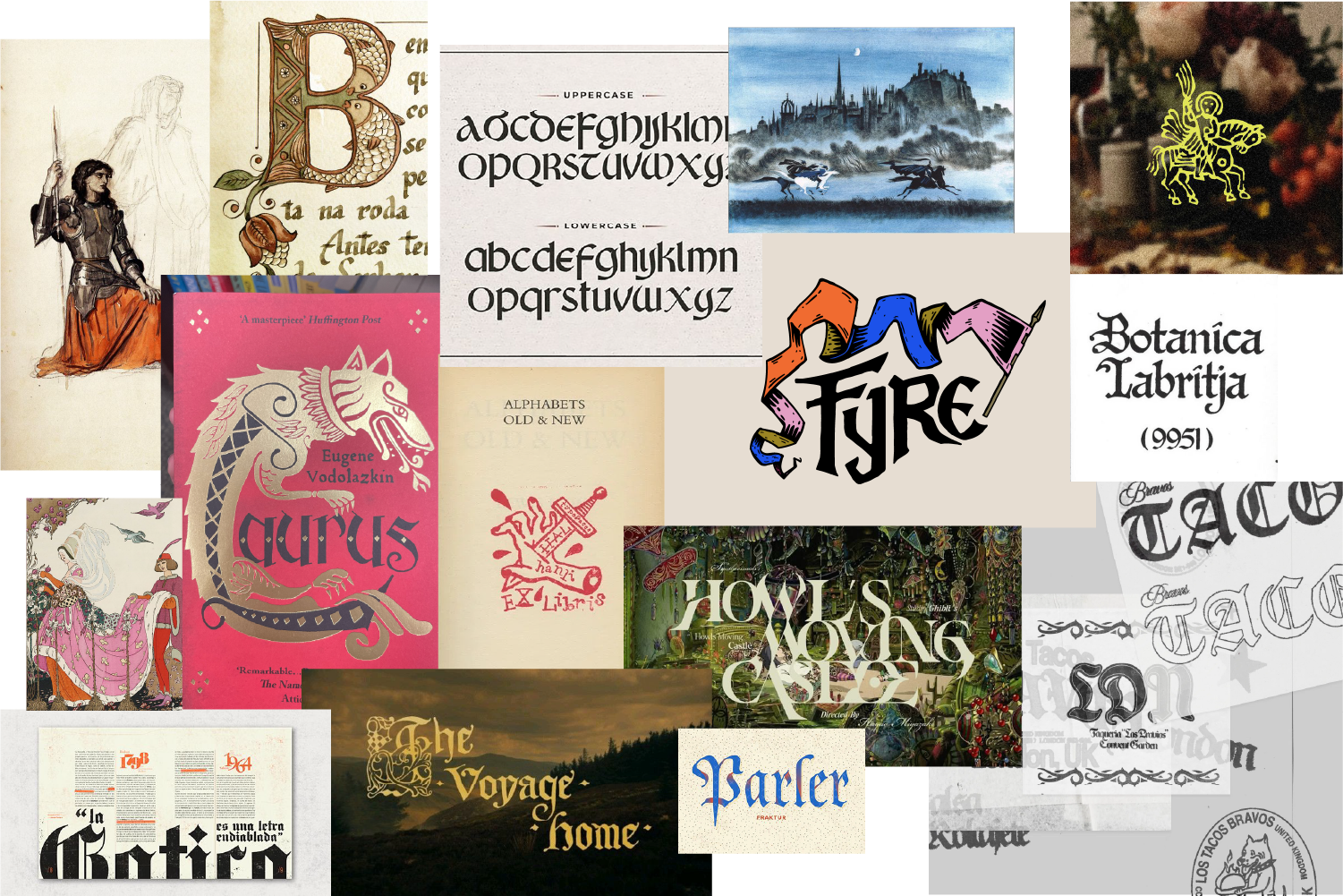
3. Build-your-own fairytale
What: Y2K, step aside. In 2025, we’re diving even further into the past to find a sense of familiarity and whimsy. We’re talking medieval and fantastical elements—think ornamental design details, hand-done visuals like stamps or woodblock prints, and slightly imperfect designs that remind us of simpler, pre-social-media days.
Why: Let’s face it, the world’s been a little chaotic. Nostalgia is like a warm, fuzzy blanket for the soul. This 2025 graphic design trend escapes back to the princesses and dragons of our childhoods, allowing for fanciful interpretations of the days of yore (without being burdened with any of that historical accuracy nonsense).
How: Throw in some ornate color schemes and textures, or use gothic blackletter style fonts that bring back that Arthurian vibe. Delicate, detailed, and deliberate is the name of the game. If your brand has a rich history, now’s your chance to flaunt it!
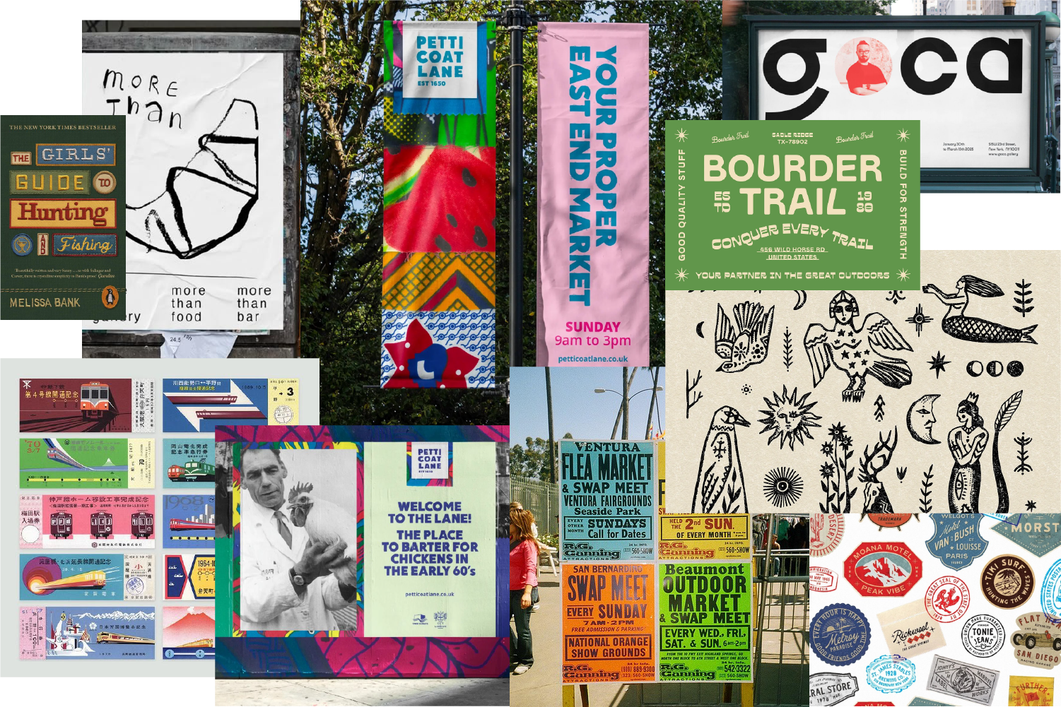
4. Home is where the heart is
What: More than ever, brands are embracing hyper-local designs that reflect their local culture and community. This means using local landmarks, neighborhood colors, or even community-sourced artwork to make designs feel uniquely tied to a place.
Why: In a world where everything feels global and mass-produced, people are gravitating toward things that feel personal and local. Brands that highlight their community roots foster loyalty and connection.
How: Lean into your local identity. Feature real people from your community instead of stock photos. Use locally inspired color palettes, landmarks, or symbols to create a sense of belonging. If you can, collaborate with local artists or designers to bring authenticity to your brand visuals.
The key takeaway?
2025 graphic design trends are all about intentionality in design. Whether you’re going bold and minimal or maximalist and nostalgic, your brand’s visuals should feel real. Small businesses, nonprofits, and churches all have stories to tell, and the right design choices can make those stories more compelling than ever.
So, as you plan your next marketing campaign, social media post, or event flyer, ask yourself: How does this design connect with people? If it sparks curiosity, emotion, or familiarity, you’re on the right track.