Have you ever found yourself scrolling through a website and thinking, “Wow, this feels like a time capsule from 2015?” You’re not alone. Our team has seen countless brands struggle to keep up with the ever-shifting landscape of digital aesthetics.
Design trends going out of style isn’t just inconvenient—old trends can actively harm your brand by making you look outdated, out of touch, or simply forgettable in a crowded market. What used to help your brand stand out might now be causing potential clients, visitors, or donors to click away from the page. But don’t worry—identifying these fading styles is the first step toward creating something truly timeless. Let’s break down a few design trends going out of style that might be holding your brand back—and explore what to embrace instead.
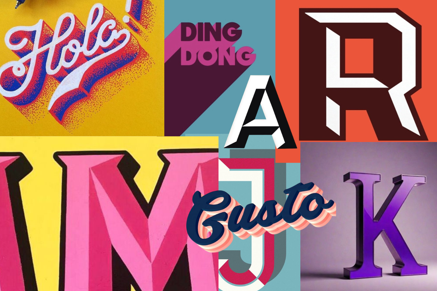
1. Bevels, drop shadows, and related abominations
Remember when every button and text box needed that 3D effect? Nothing screams “I built this on Microsoft Word in 2003” quite like excessive beveling, dramatic drop shadows, and grunge filters. Once seen as ways to add depth and sophistication, these effects now feel more like relics of design trends going out of style.
As with any design choice, it’s critical to evaluate how a trendy effect, texture, or filter will impact your brand’s accessibility, flexibility, and longevity—something that these design choices don’t take into consideration. Flat design has come a long way, and today’s best experiences use contrast, hierarchy, and negative space to create depth without resorting to those old-school tactics. Here’s a friendly tip: if you need a drop shadow to make your text readable, it’s probably time to rethink your colors and layout instead.
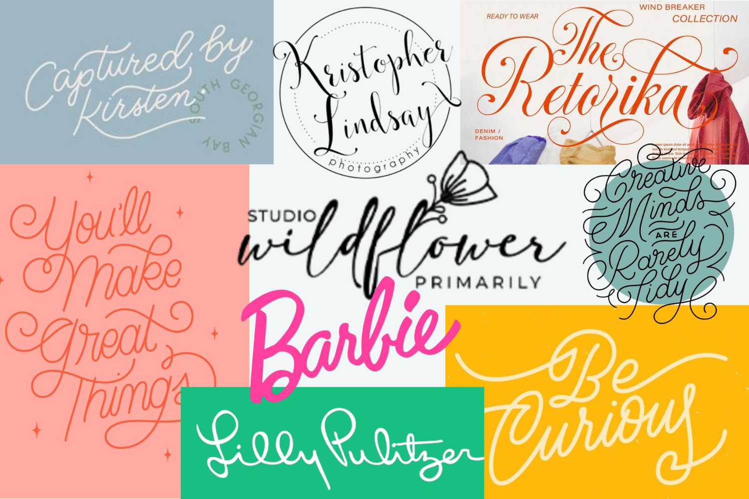
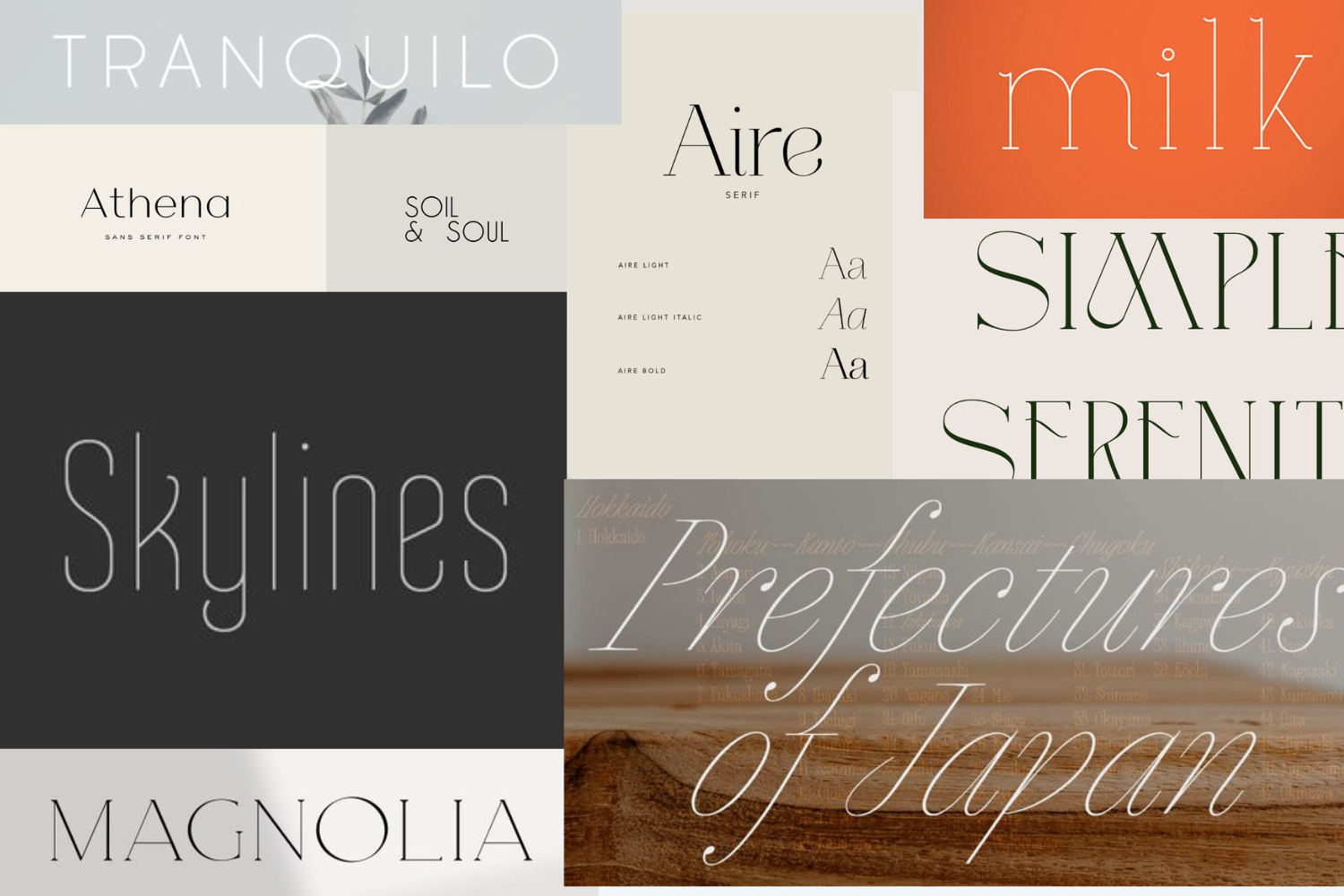
2. “Live, Laugh, Love” typography
At some point, swirly modern calligraphy fonts went from charming and quirky to absolutely everywhere. You know the ones—those handwritten-ish typefaces that show up on everything from wedding invites to your aunt’s decorative wall art.
While these fonts can still work in certain brands or niches, they’ve lost the charm they once had. They’re hard to read, don’t scale well, and can make a professional brand look more like a DIY craft blog.
Overusing these trendy calligraphy staples is a telltale sign that your branding may be built on design trends going out of style. Instead, you should reach for timeless serif pairings or classic script fonts with real elegance—fonts that still feel personal but have proven staying power.
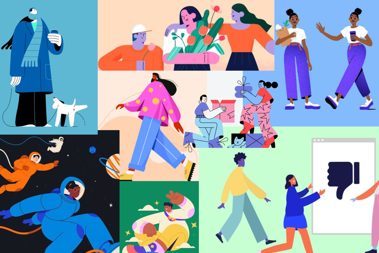
3. The “Corporate Memphis” illustration style
We’ve all seen them—the colorful characters with stretchy limbs and purple skin doing random things for no clear reason. This illustration style exploded in popularity thanks to tech giants like Facebook and Google in the late 2010s. The vibe was supposed to be friendly and inclusive, but it quickly became the one-size-fits-all style that every startup adopted.
The issue? These illustrations were designed to be generic, and that’s exactly how they come across. As more brands move toward authenticity and originality, design trends going out of style like Corporate Memphis are quickly being replaced by custom illustration, natural photography, or mixed-media visuals that feel real and relatable.
Unless your brand identity is “generic tech company circa 2018-2022,” it might be time to throw a retirement party for these oddly-proportioned figures.
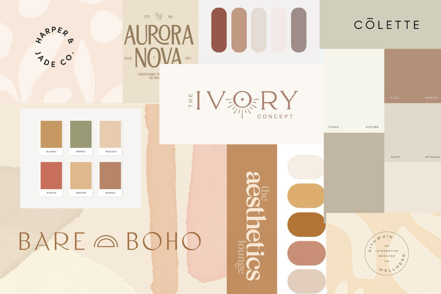
4. The oat milk aesthetic
You know the one. Soft taupes, dusty peaches, warm terracottas—it’s the palette that launched a thousand wellness brands. There’s nothing wrong with a calm, peaceful vibe, but when everyone uses the same five warm earth tones? It starts to feel like a boho chic desert out there.
If your website looks like it was dipped in oat milk, you might be blending into a sea of brands that all feel copy-pasted. While it once felt fun and cozy, it’s now one of the more noticeable design trends going out of style. That’s why we’re seeing a welcome resurgence of bold, vibrant color schemes—especially those that balance clean neutrals with a pop of genuine personality.
5. Ultra-thin minimalist fonts
Minimalist design is here to stay—but some of its stylistic choices are not. Enter: the ultra-thin font. At first, these whisper-thin typefaces felt sleek and high-end. Now? They’re hard to read on older screens and mobile devices, have accessibility issues, and often appear washed out in print.
Many designers fell in love with minimalism but forgot that clarity and impact matter more than elegance alone. If your typeface disappears at small sizes or looks like it needs a magnifying glass, it’s probably one of those design trends going out of style that’s best left behind.
So, what does “timeless” actually look like?
Let’s be clear: timeless doesn’t mean boring. In fact, timeless design often feels more compelling because it’s not trying so hard to chase the next big thing. It’s rooted in purpose. It adapts. It lasts.
Staying aware of design trends going out of style isn’t about playing it safe—it’s about playing it smart. The goal isn’t to freeze your brand in time, but to create something resilient and adaptable that still feels fresh years down the road.
As the legendary designer Dieter Rams put it, “Good design is long-lasting.” Whether you’re refreshing an outdated website or building a brand from scratch, choosing enduring design principles over fleeting fads is one of the smartest investments you can make.
If you’re looking to sidestep design trends going out of style, focus on these principles:
- Prioritize usability over novelty: Fancy effects feel dated quickly, but intuitive experiences never go out of style.
- Embrace purposeful uniqueness: Build your brand around your story, not someone else’s Pinterest board.
- Focus on clear communication: When typography, color, and layout serve your message (rather than competing with it), the design remains relevant longer.
- Test with real users: The most timeless designs are those that actually work for the people using them.
When we work with clients, we don’t just help them avoid yesterday’s mistakes—we partner with them to build a visual identity that feels meaningful, memorable, and built to last. If your brand’s looking a little dusty, don’t panic. Our team is here to help you modernize without chasing every shiny new trend. Let’s create something that won’t end up on next year’s “design trends going out of style” list.